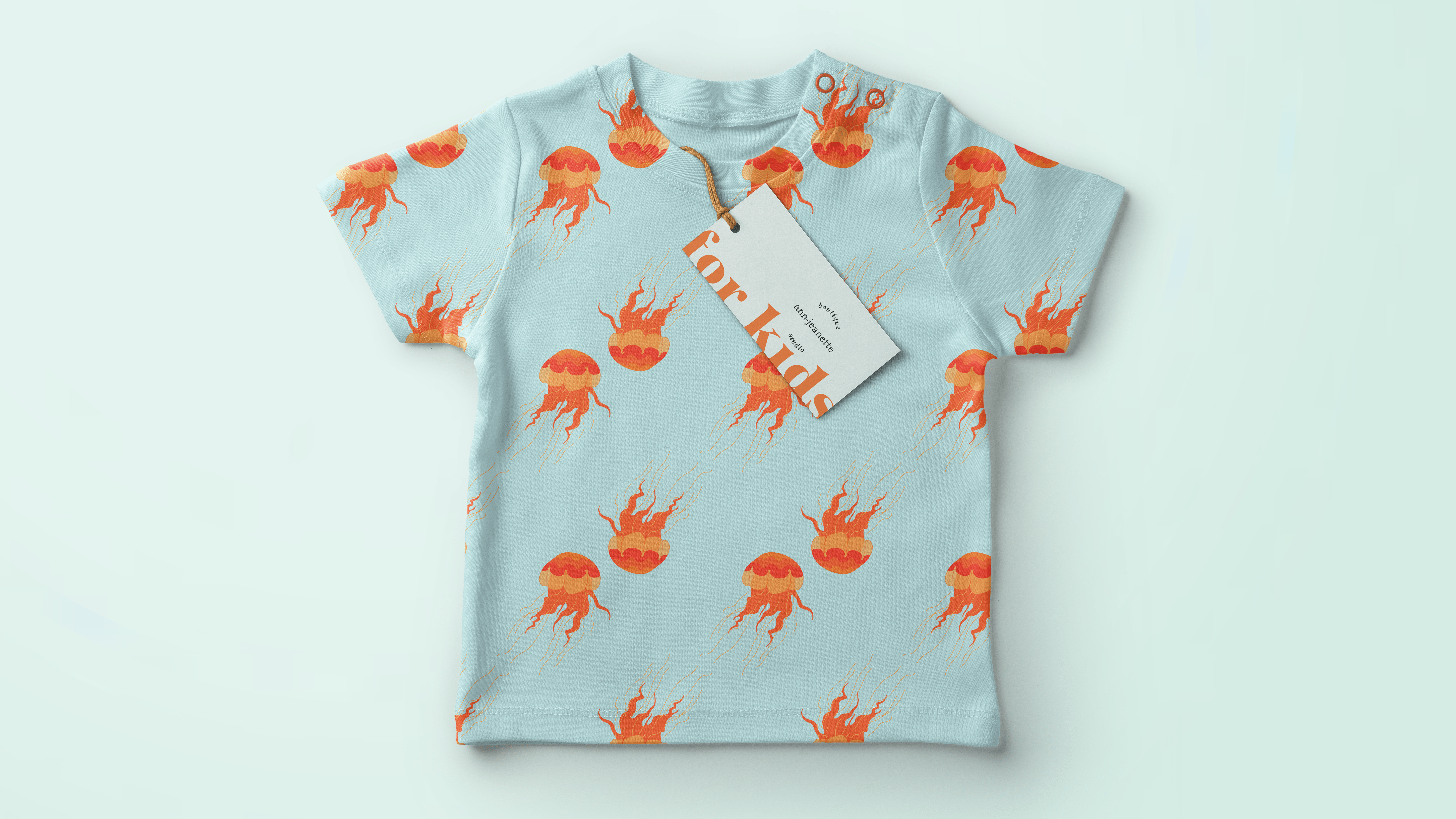
Brand Pattern and Illustration | Art Deco-inspired
Description
The purpose of this project was to show how a Brand Illustration, and a Brand Pattern can elevate the Branding-Experience, and communicate the Brand efficiently on multiple platforms and show how it can be used in different ways- packaging, products, office collateral, posters, etc. It is meant to showcase and underline the importance of Branding, and not "just a logo".
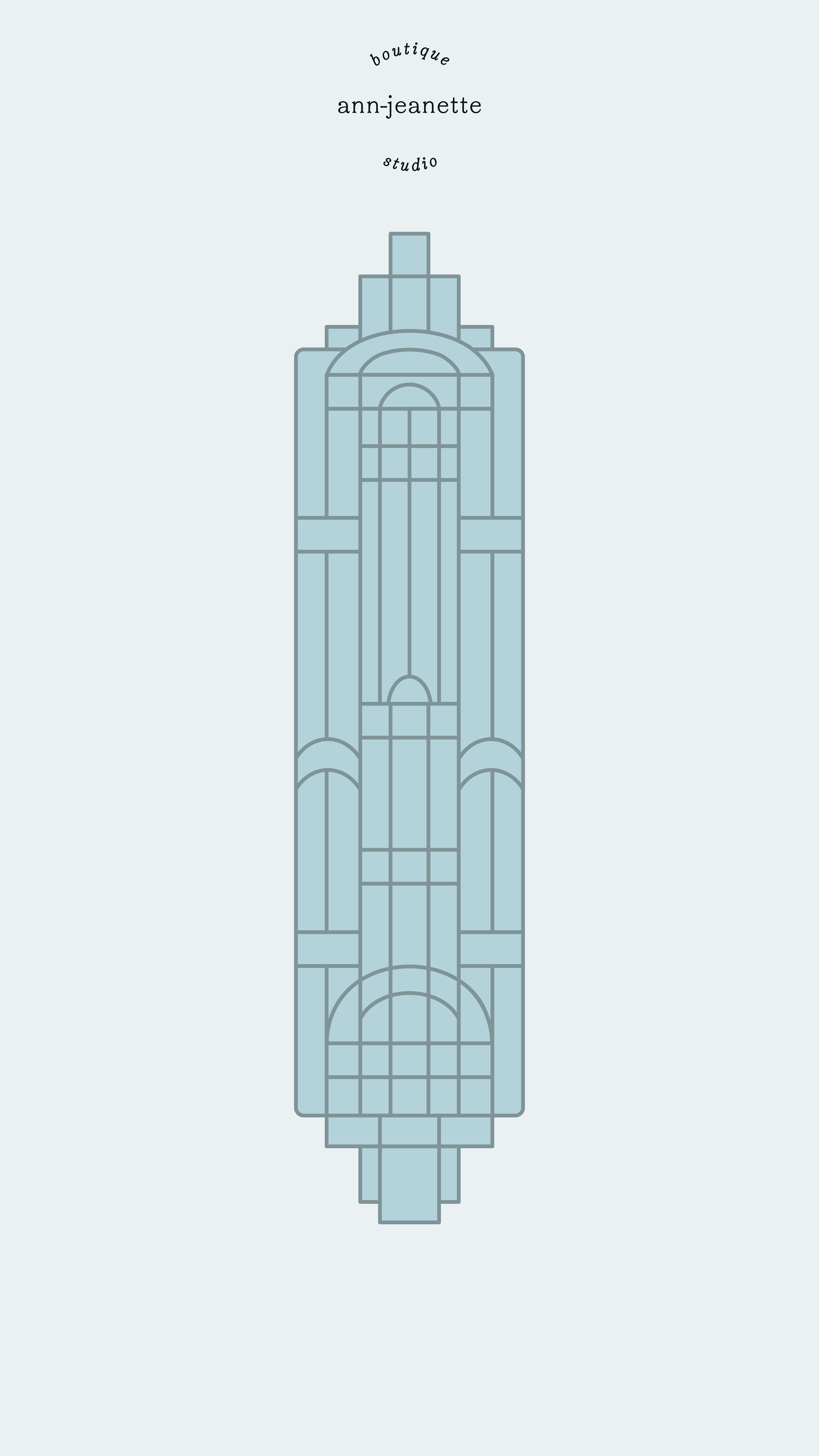
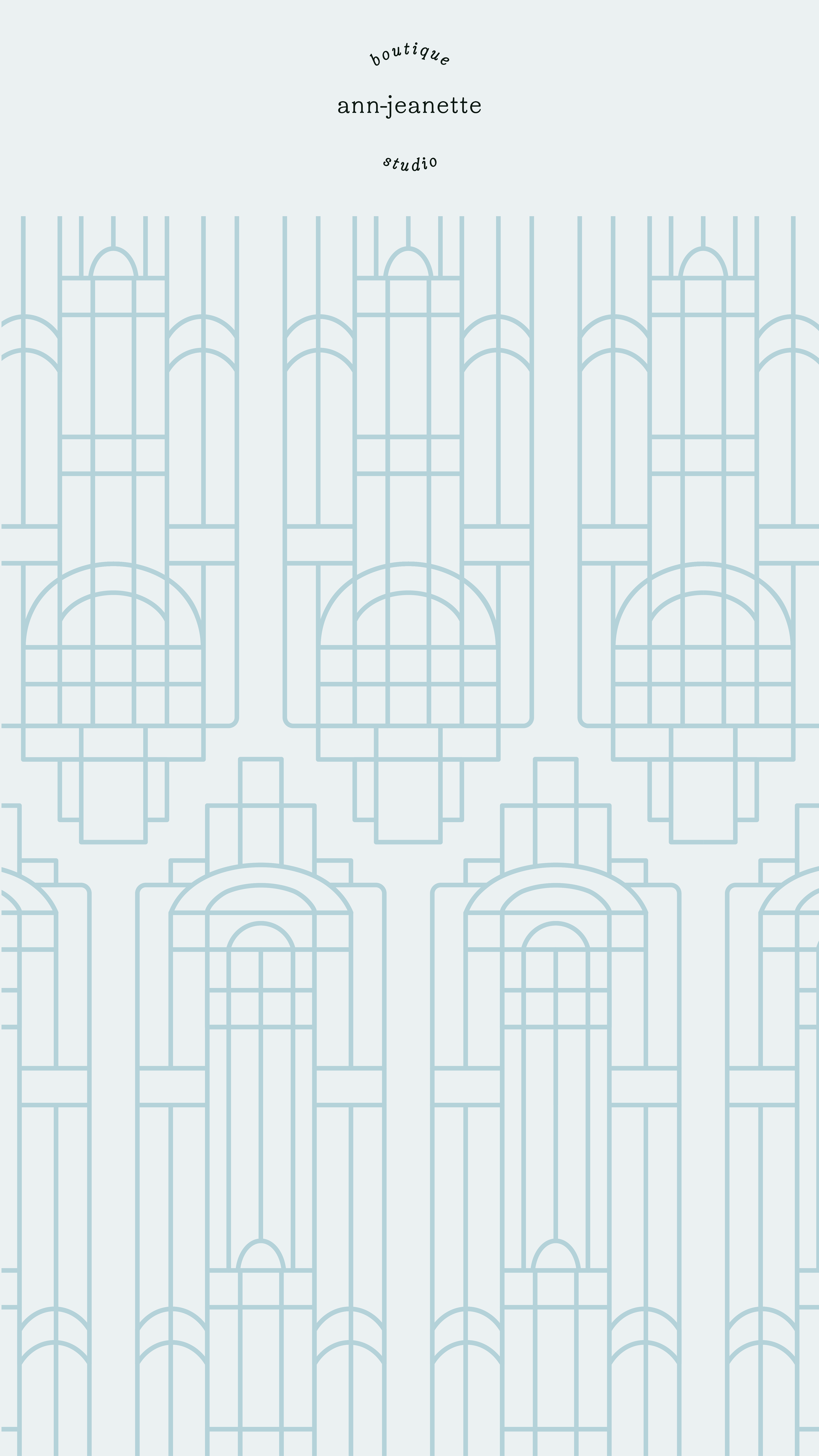
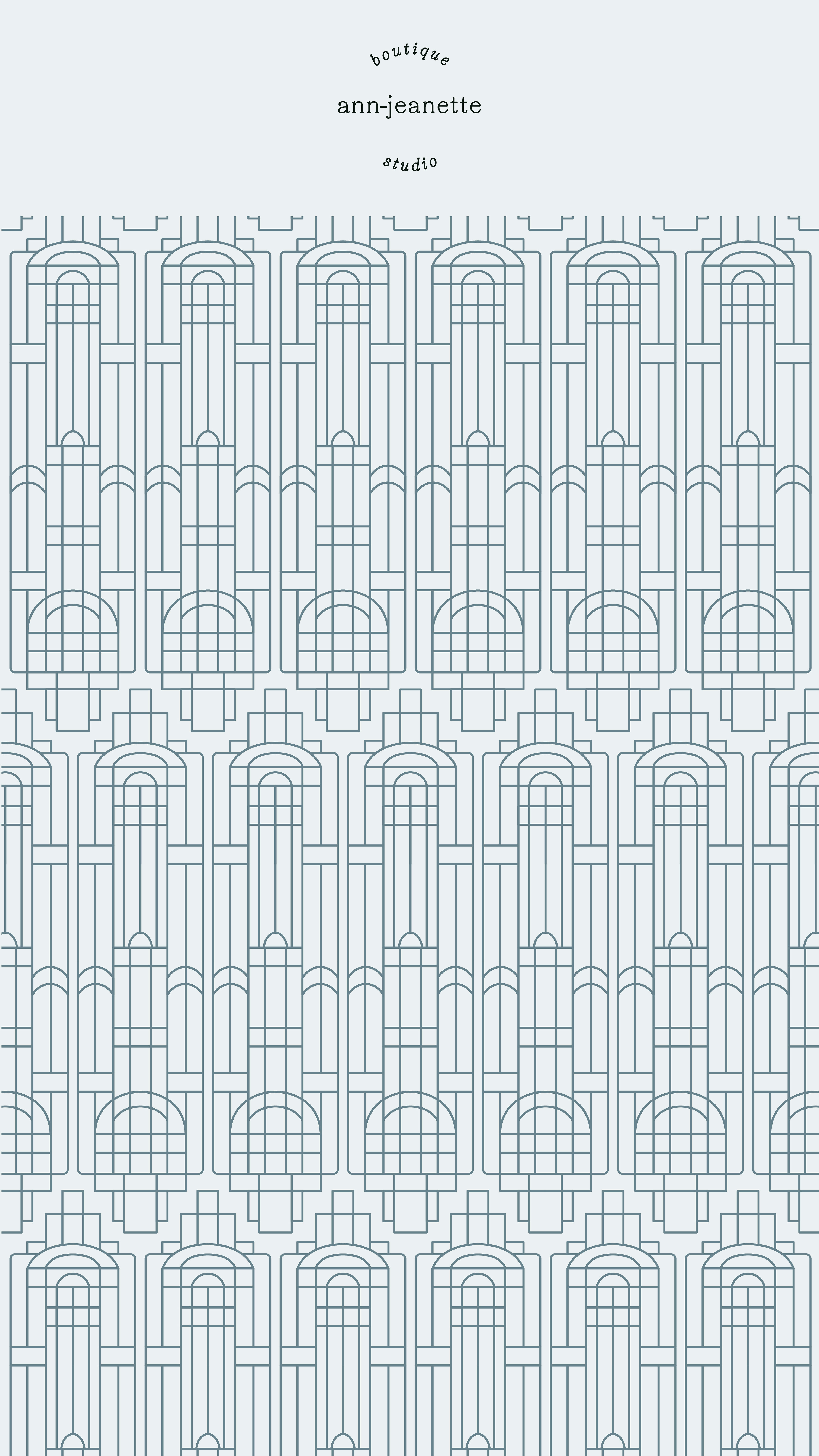
The 3 images below show the "base" illustration, and then the patterns derived from said illustration. The Brand Illustration itself is inspired by the shapes of the Art Deco-era, with a modern touch; as it is quite minimalistic and does not showcase the typical luxury and richness of materials and colors, as for example gold, found in the era.
In this instance, I have chosen to use my own logo and my own brand colors.
I've also decided to focus on the pattern and/or illustrations, and not so much on typography, and product naming (Ex. giving the chocolate bar a description and naming).
I hope you like what you see, thank you.
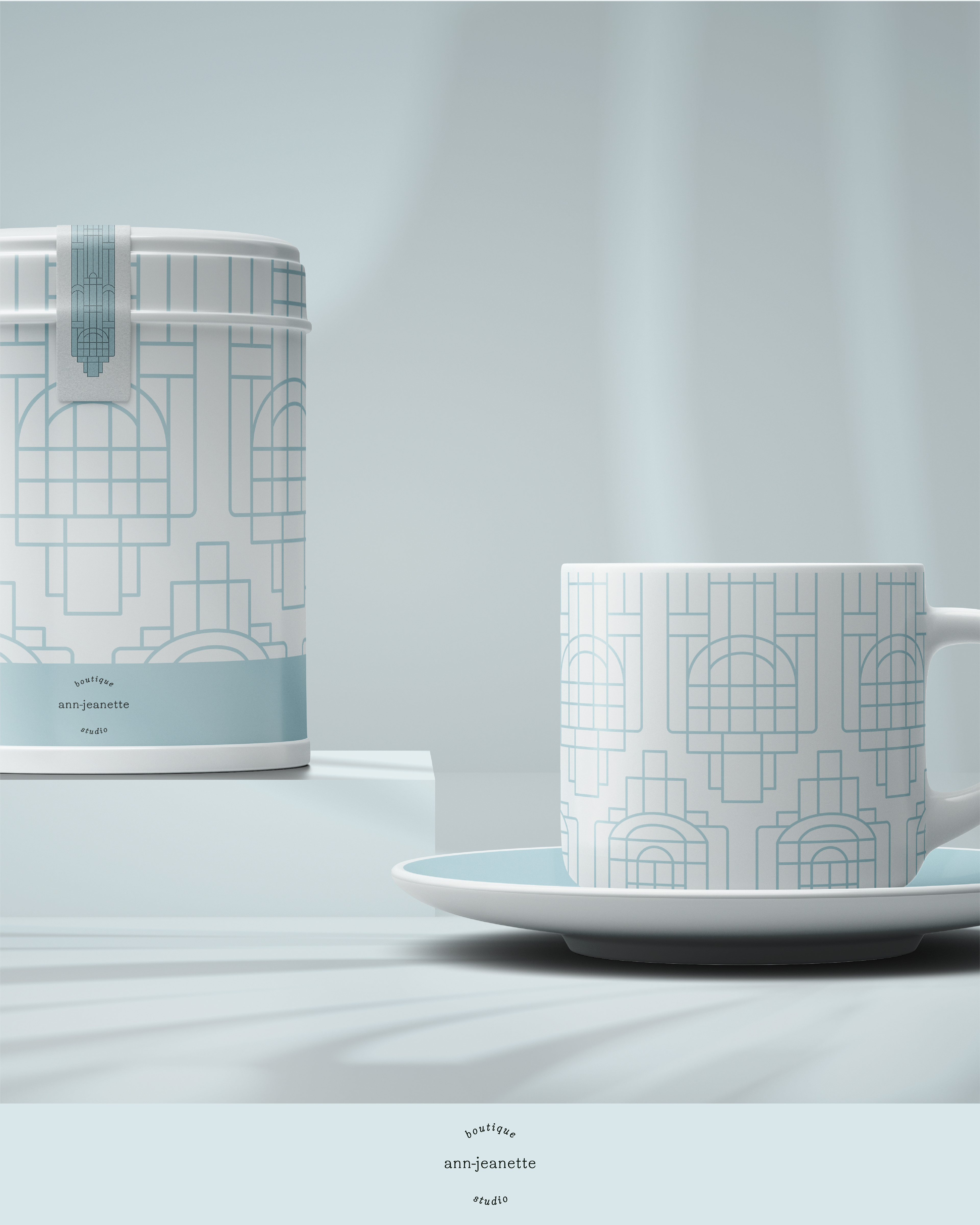
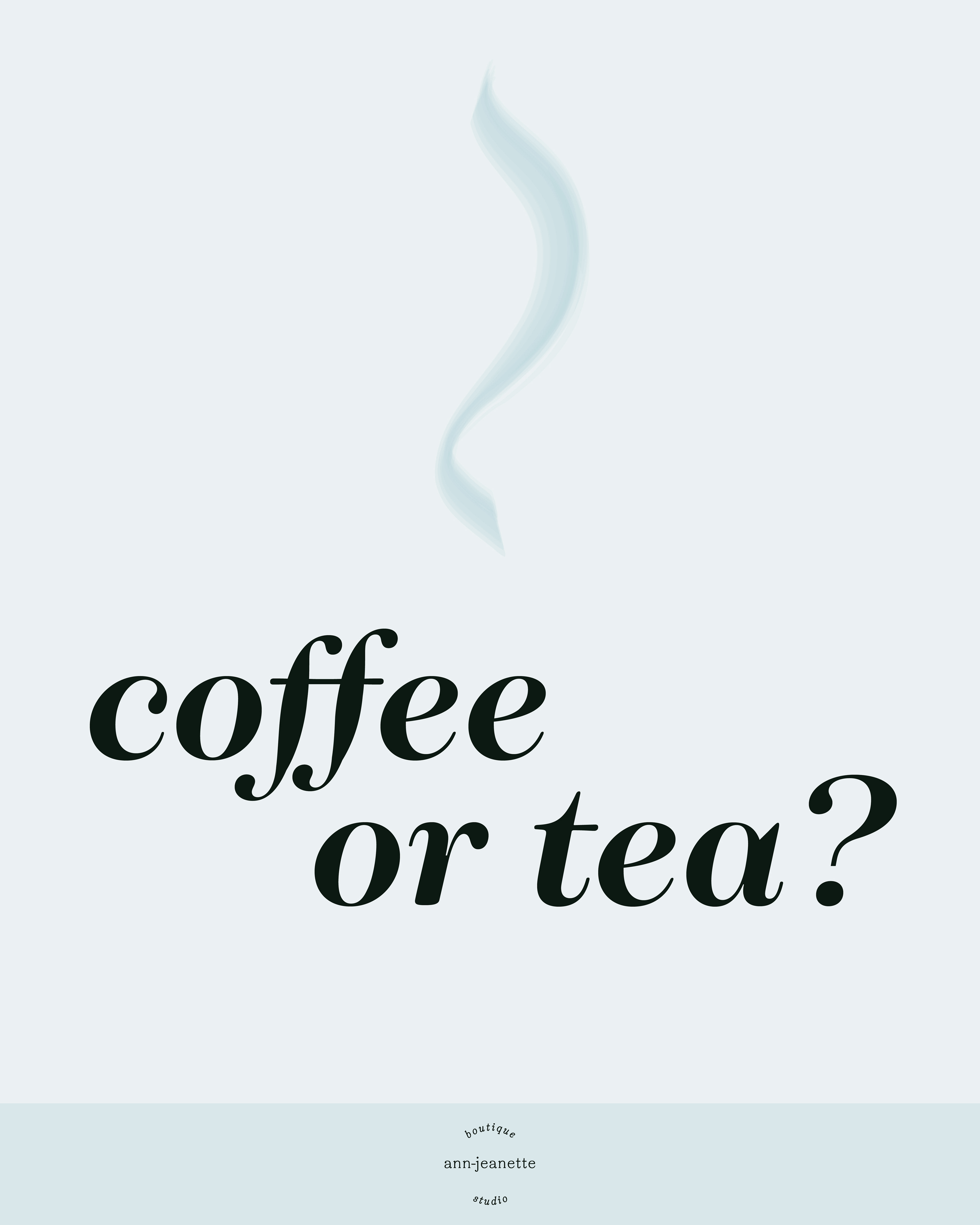
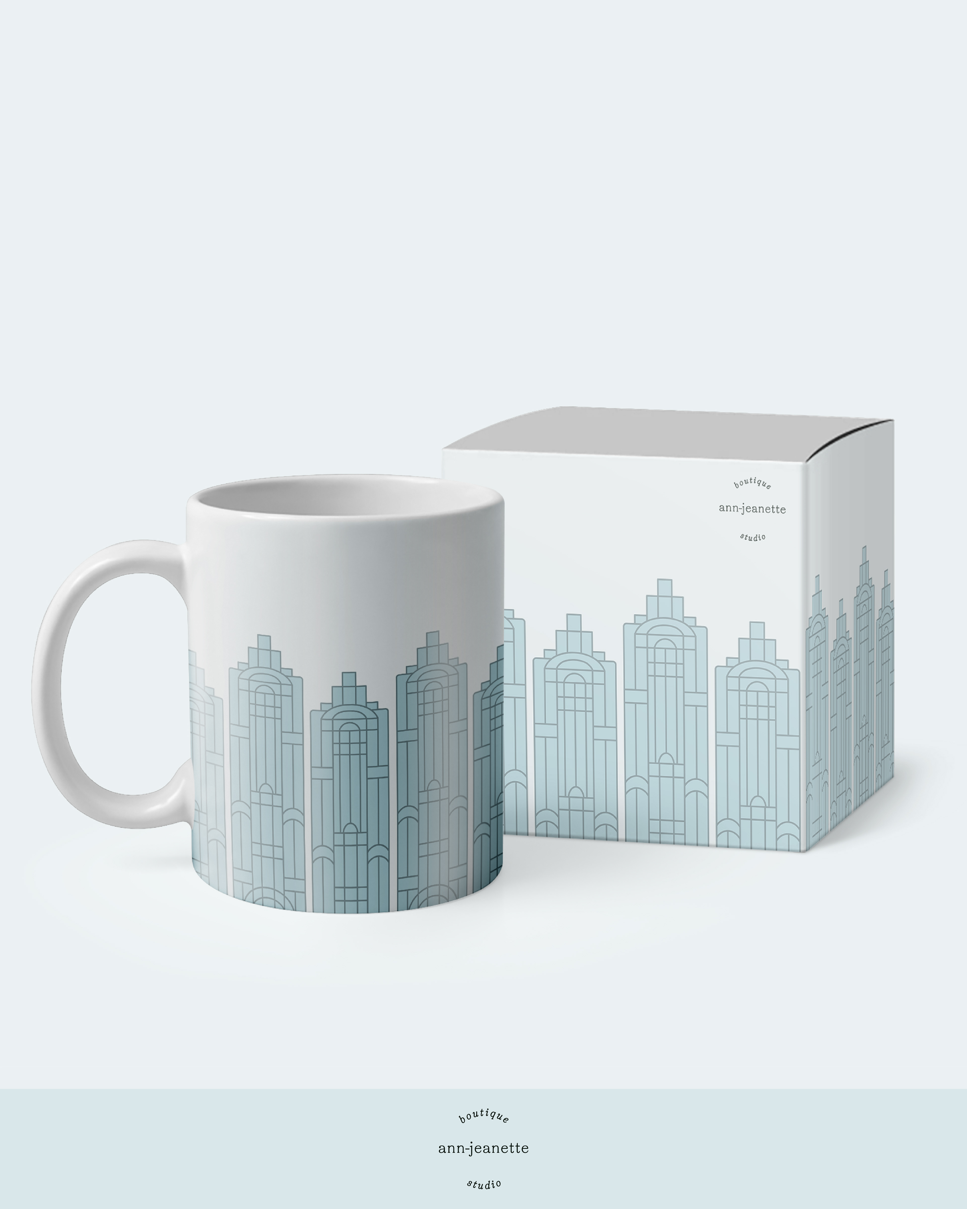
What do you prefer? Coffee or Tea?
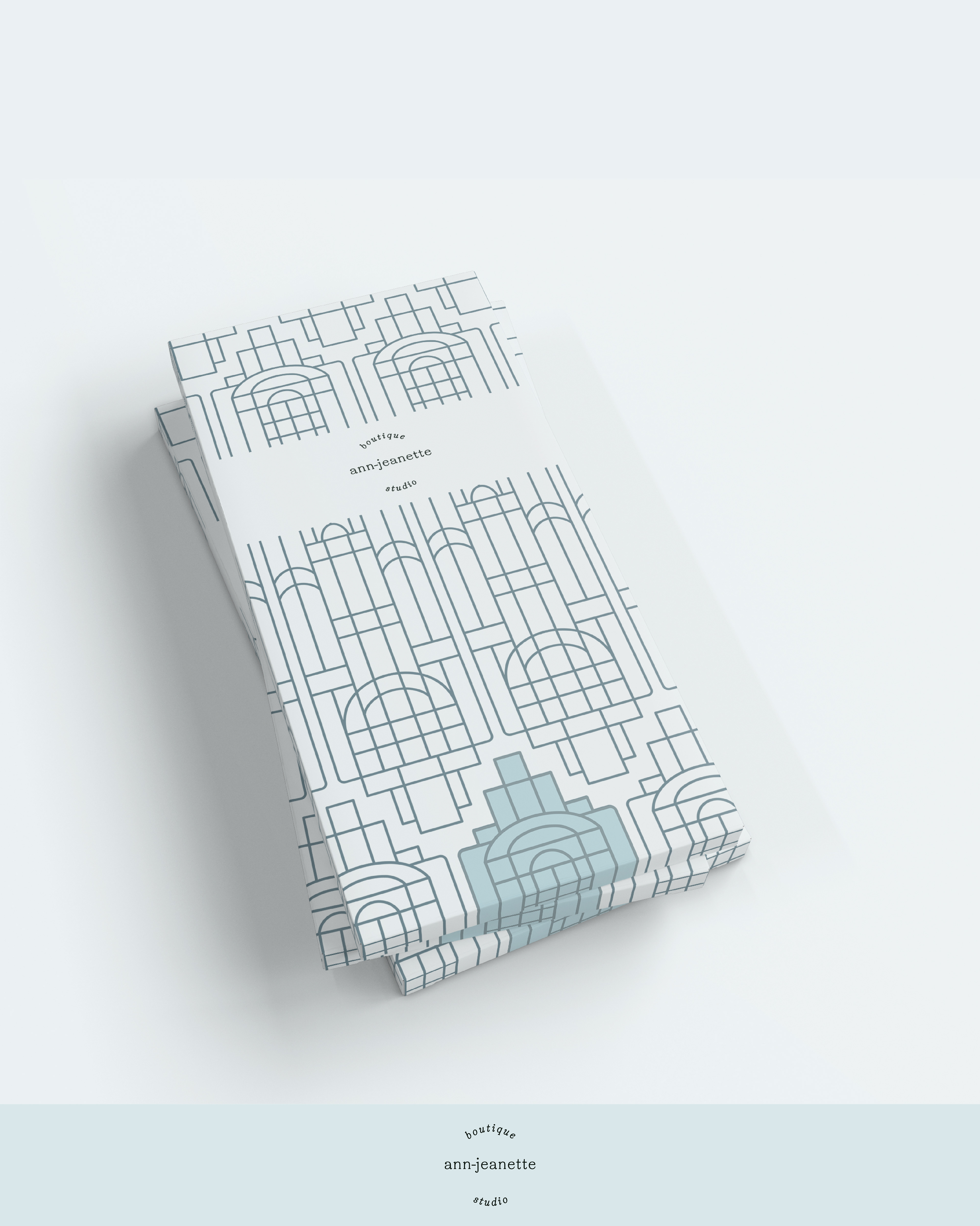
Would you like some luxurious chocolate with that coffee/tea? I'm imagining a dark, velvet chocolate, with a light sprinkle of sea salt, and a hint of licorice. Mmm
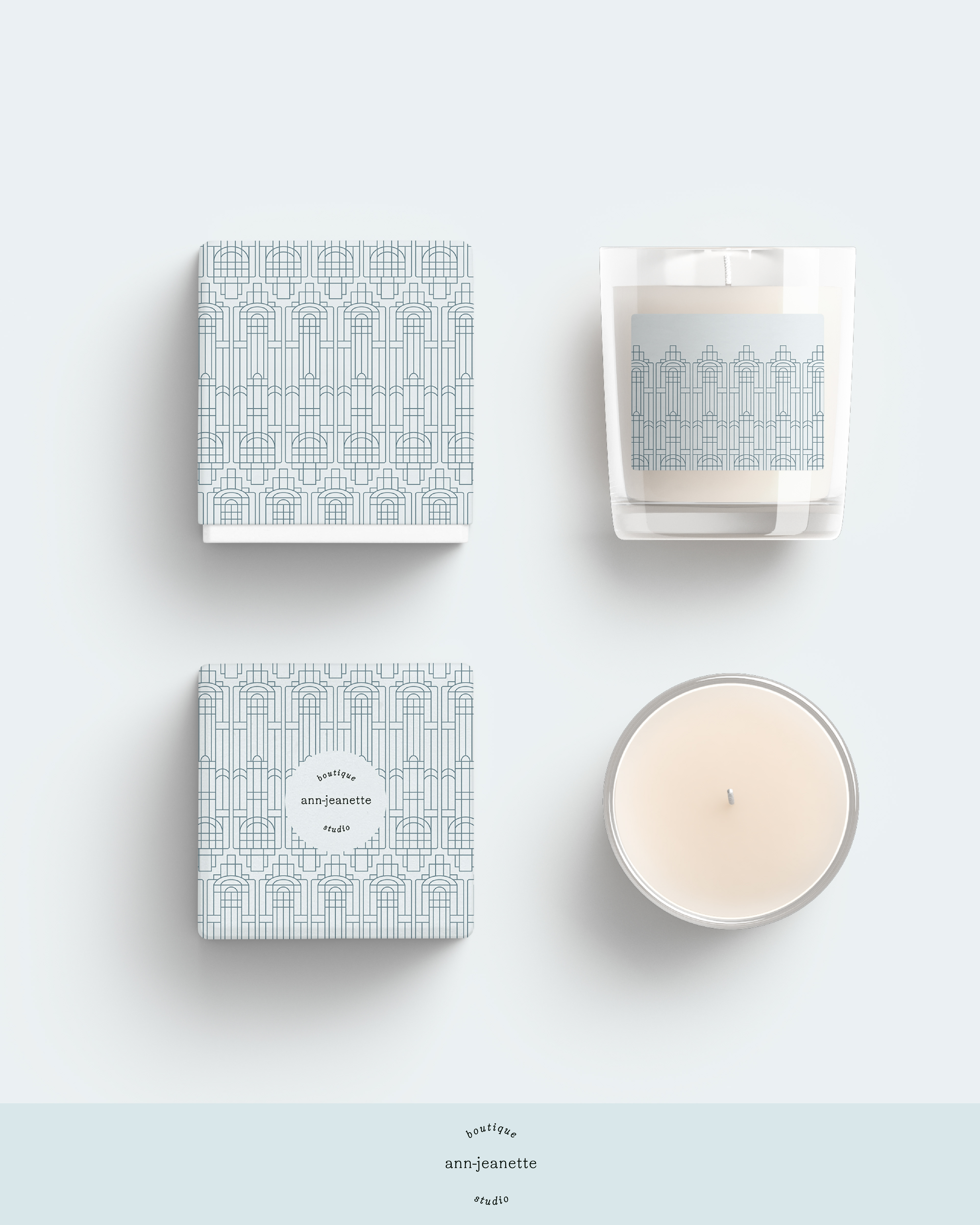
Moving on to the lifestyle-section, the Brand Pattern fits perfectly for packaging on these candles.
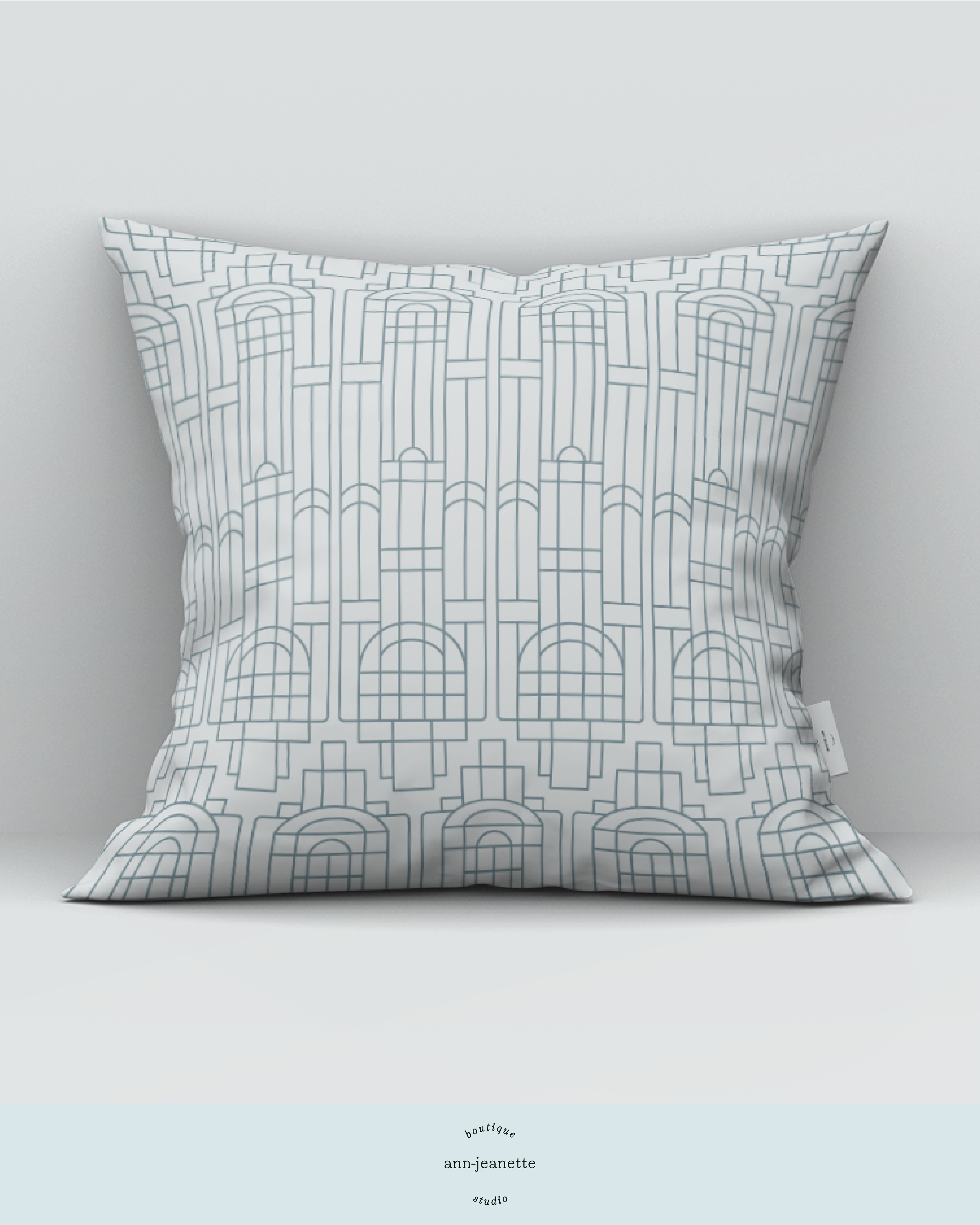
How about a comfy pillow?
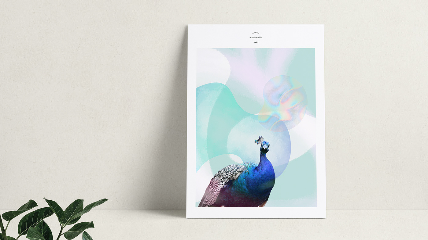
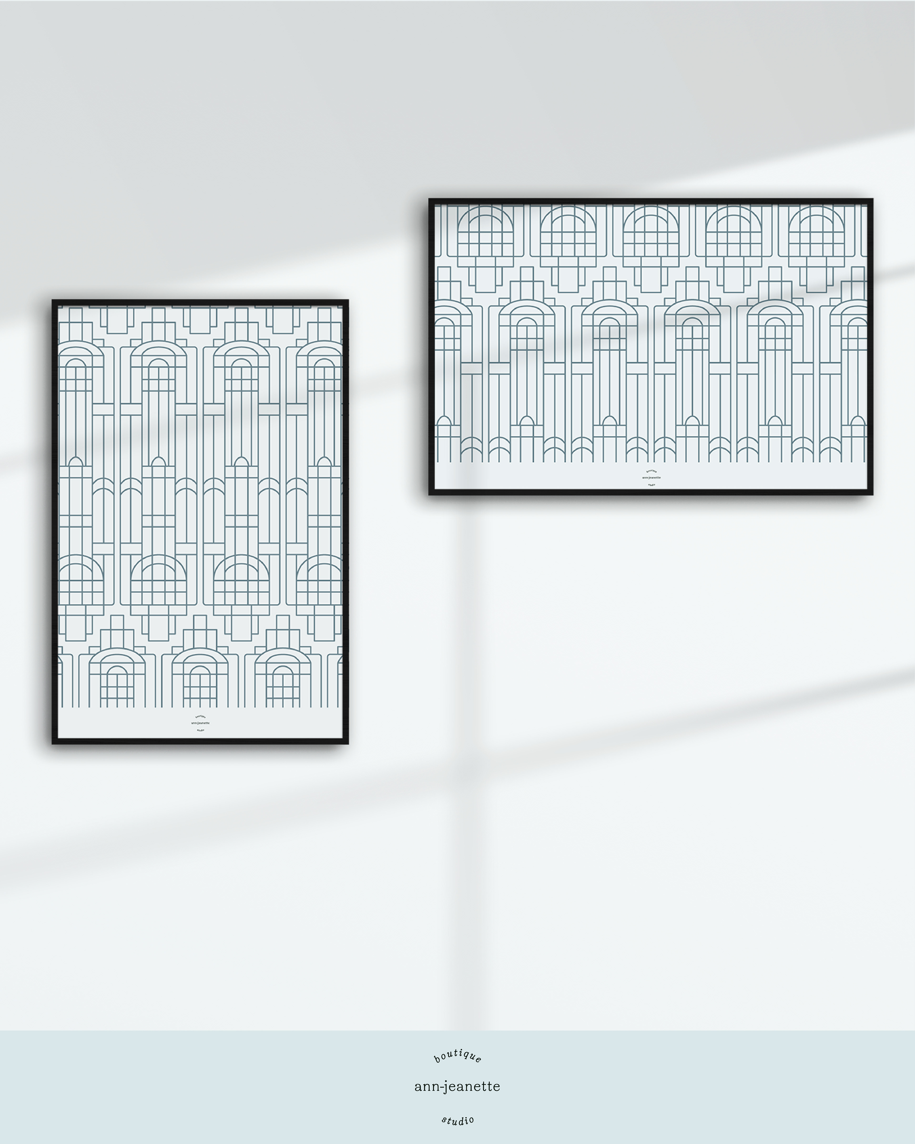
...Or some custom posters?
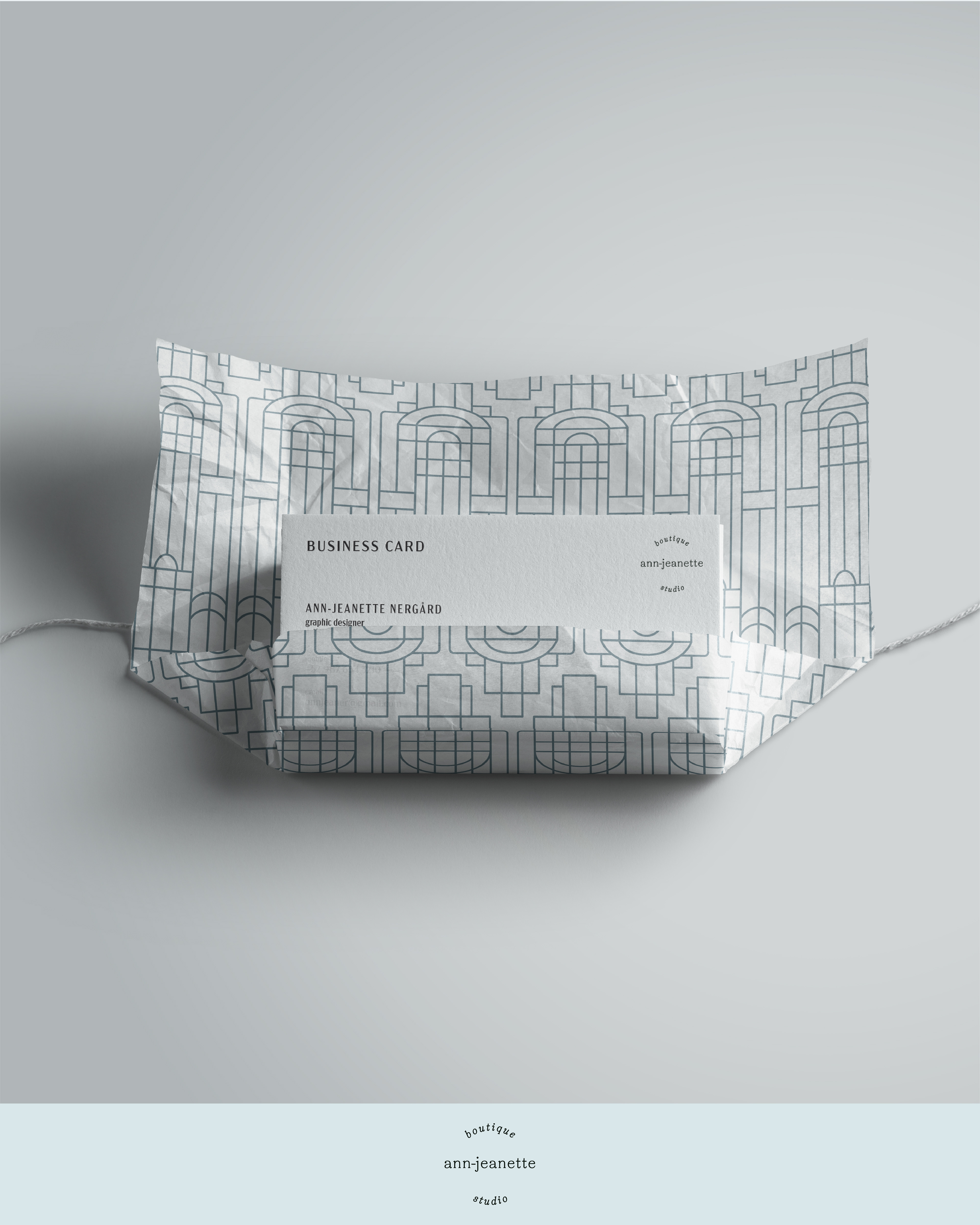
As an example of a Business Card, and some custom wrapping.
Shell Pattern
Underneath you can see another seamless pattern tile, that I have created based on the idea of a fish scale tile, and then creating the lines inside to resemble a shell. This is true Art Deco-style, connecting with nature on that pure, geometric grid. Mock-ups will be added later on to showcase this pattern on a larger scale and as examples of usage of a Brand Pattern like this.
If you're curious how I used this pattern myself, I created a Christmas Star with the printed pattern, and this can be viewed on my Instagram-Stories/BTS, starting here: https://www.instagram.com/stories/highlights/18051331642241842/


All my design work is based on research and strategy.
Thank you for reading, liking or appreciating my project, I'm truly grateful!
Thank you again,
Ann-Jeanette
