Branding for 'Ca-Va Diseños'
Scope
- Colors
- Typography
- Logos
- Style Expression
- Instagram Highlights
- Brand Style Guide
Description
Ca-Va Diseños is the sweetest brand for accessories for babies, girls and their beautiful moms. She makes the most beautiful hair bows and accessories for all occasions - and she even made my wedding veil decorated with love infused crystal beads. They are all made by hand with high quality, uniquely designed, and can be personalized according to client needs. Additionally, she makes costumes to match, belts, etc.
I did her branding a while ago for a school project,
and as I've evolved as a designer, I decided to do her rebrand on top of that. All my design work is based on research and strategy, so I just had to apply that in a different way. I really am pleased with the results, and I had so much fun with it as well.
and as I've evolved as a designer, I decided to do her rebrand on top of that. All my design work is based on research and strategy, so I just had to apply that in a different way. I really am pleased with the results, and I had so much fun with it as well.
I also created a version that didn't make the cut, but loved how it turned out, so make sure to check that one out as well.
This is what Hary had to say (translated from Spanish):
"So grateful - I absolutely LOVE our renewed branding, and I've been getting so many compliments from my current customers, and I've been having more engagement on my posts on social media. Ann-Jeanette has a totally fresh vision that she undoubtedly will infuse into your project, either you are starting out, or renewing your image."
- Ca-Va Diseños


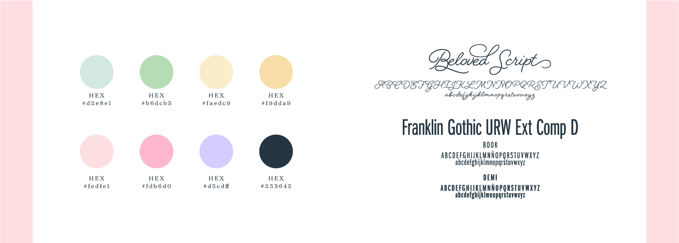
Typography
The typography is Beloved Script, via Adobe Fonts, designed by Laura Worthington. Laura describes this monostroke script as "the hand of a romantic spirit", and that its strokes evokes "classic 20th-century penmanship achieved with a ballpoint or rounded nib. Beloved Script embodies a casual and natural state of handwriting: the semi-connected script."
I have paired it with a classic sans serif called Franklin Gothic URW, via Adobe Fonts, designed by URW Type Foundry, which is "one of the most classic typefaces from the early 20th century. Guiding the way for American Gothic typefaces ever since, it is still popular and iconic to this very day".
Franklin Gothic URW further underlines the classic vibration of the brand, as well as having a stabilizing and grounding effect by balancing out Beloved Script. They work well together because of the contrast between them, but also because they are from, or inspired by, the same era.
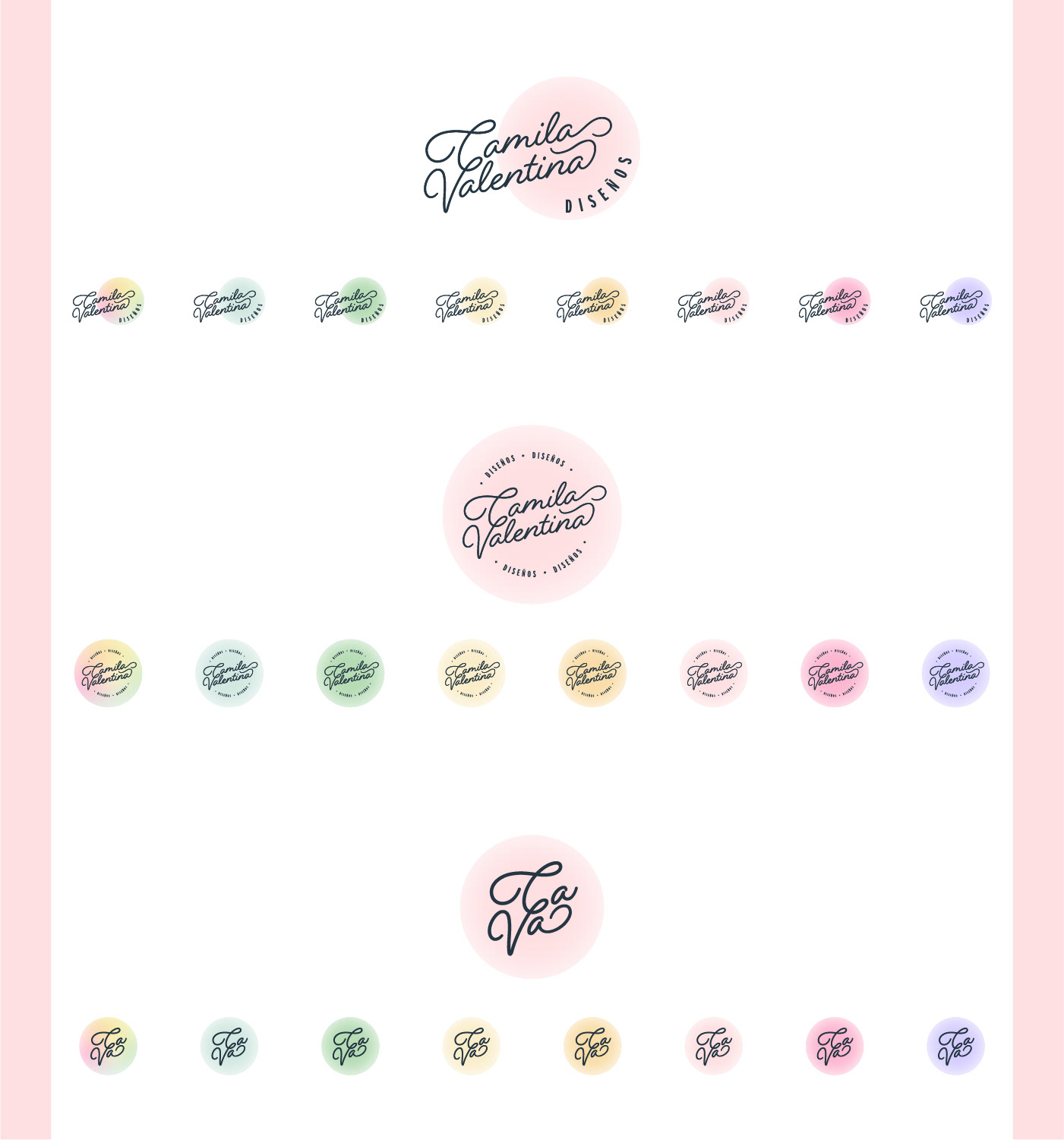
Colors
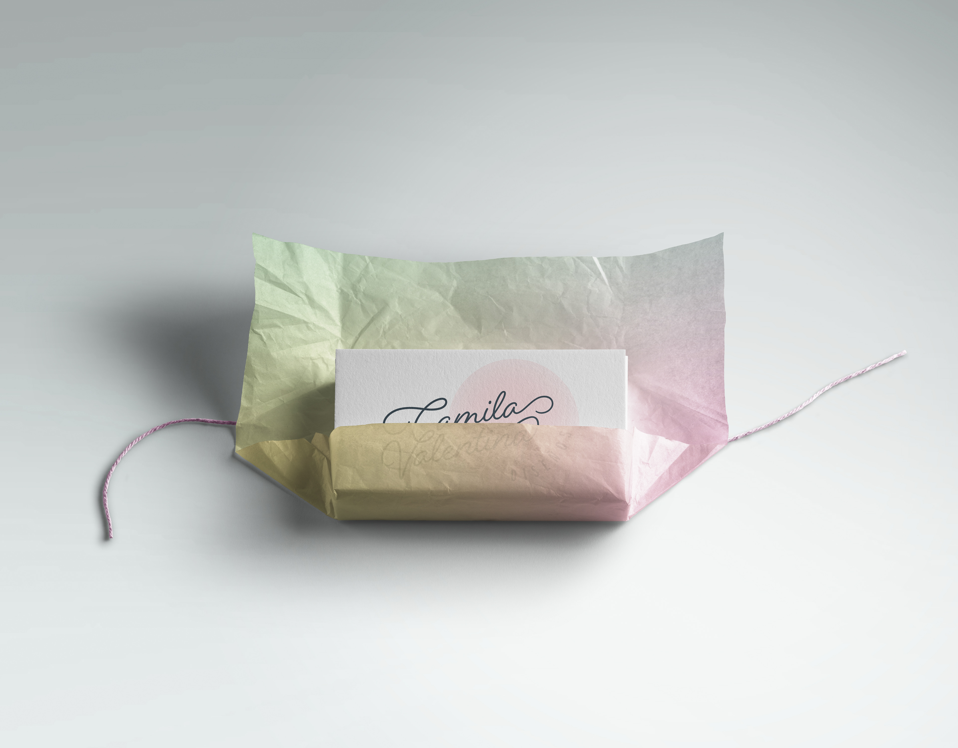
The palette has multiple "rainbow" colors, that are soft and feminine, yet fun. I have also included a navy blue for contrast and that touch of seriousness for conveying trust and quality. All of which works really well for the brand - especially since Ca-Va Diseños are having many seasonal sales, with multiple types of products, and in the future will be having additional collections/lines. The thought is that each color could represent the different sections of her business.
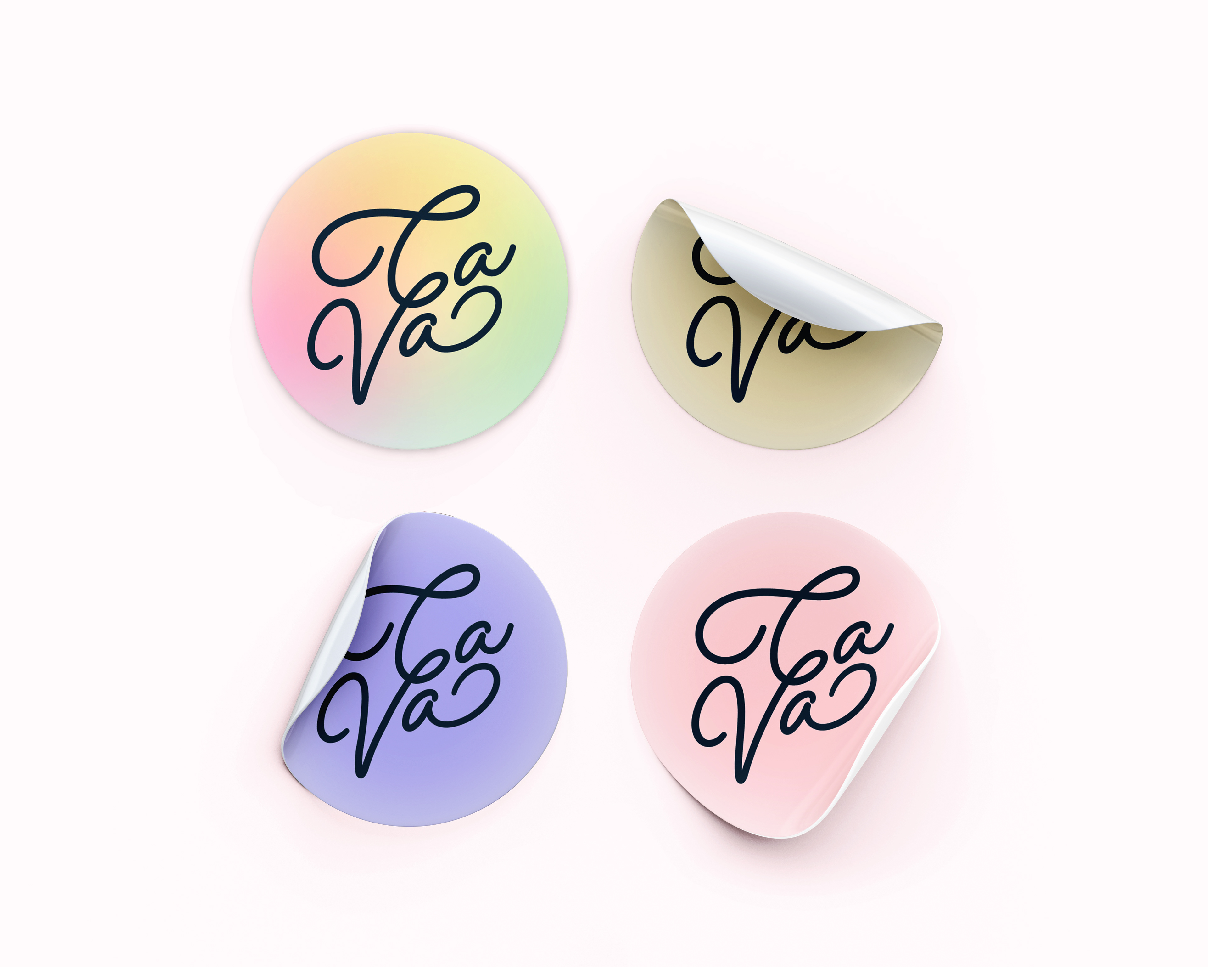
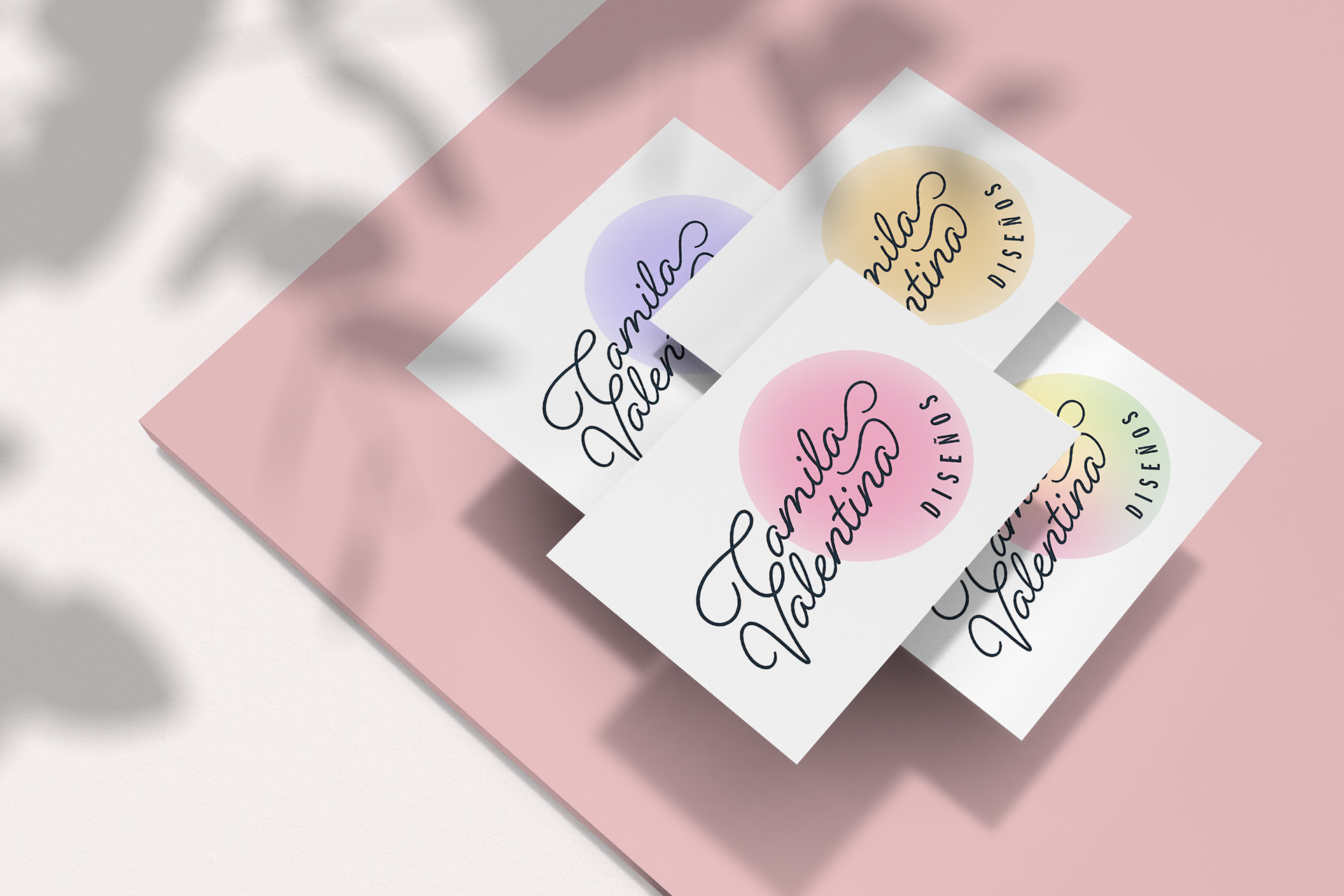
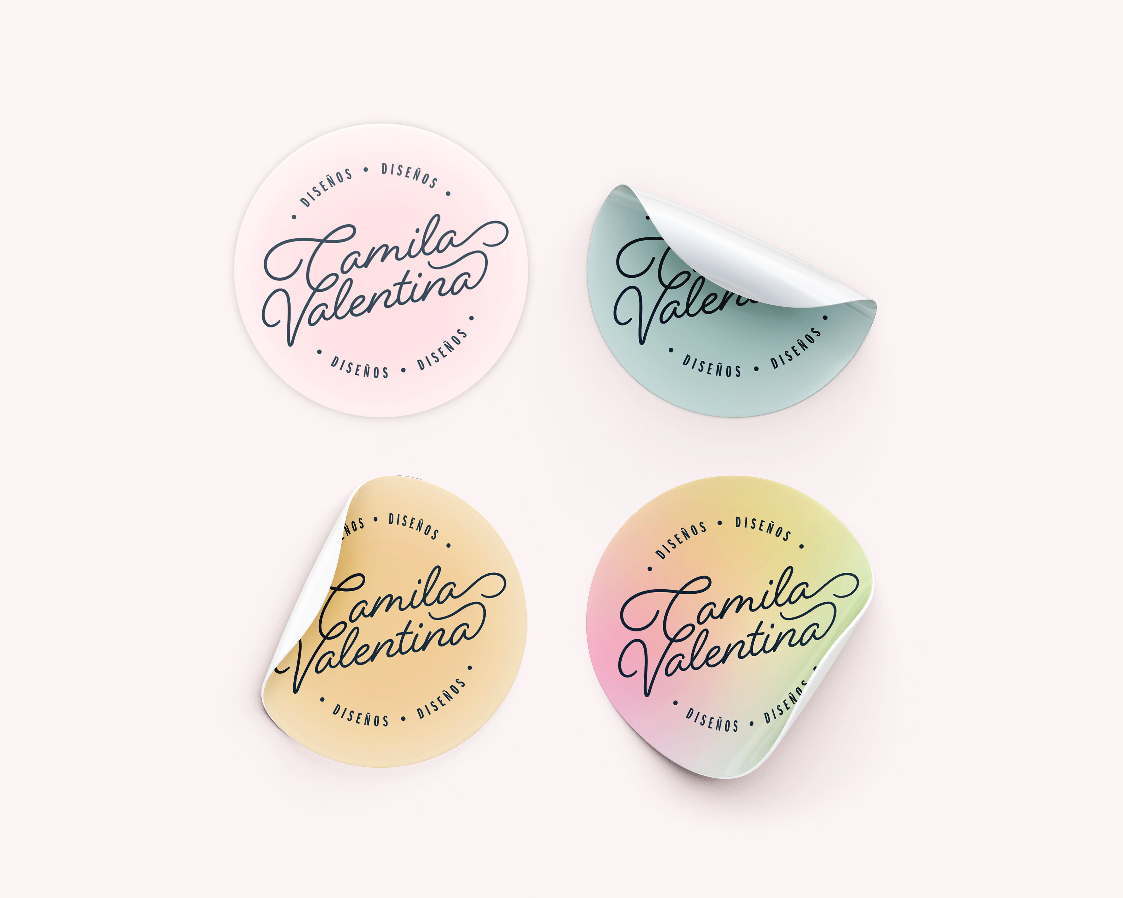
The simplified "Ca-Va" logomark is great for smaller, circular stickers.
Logo
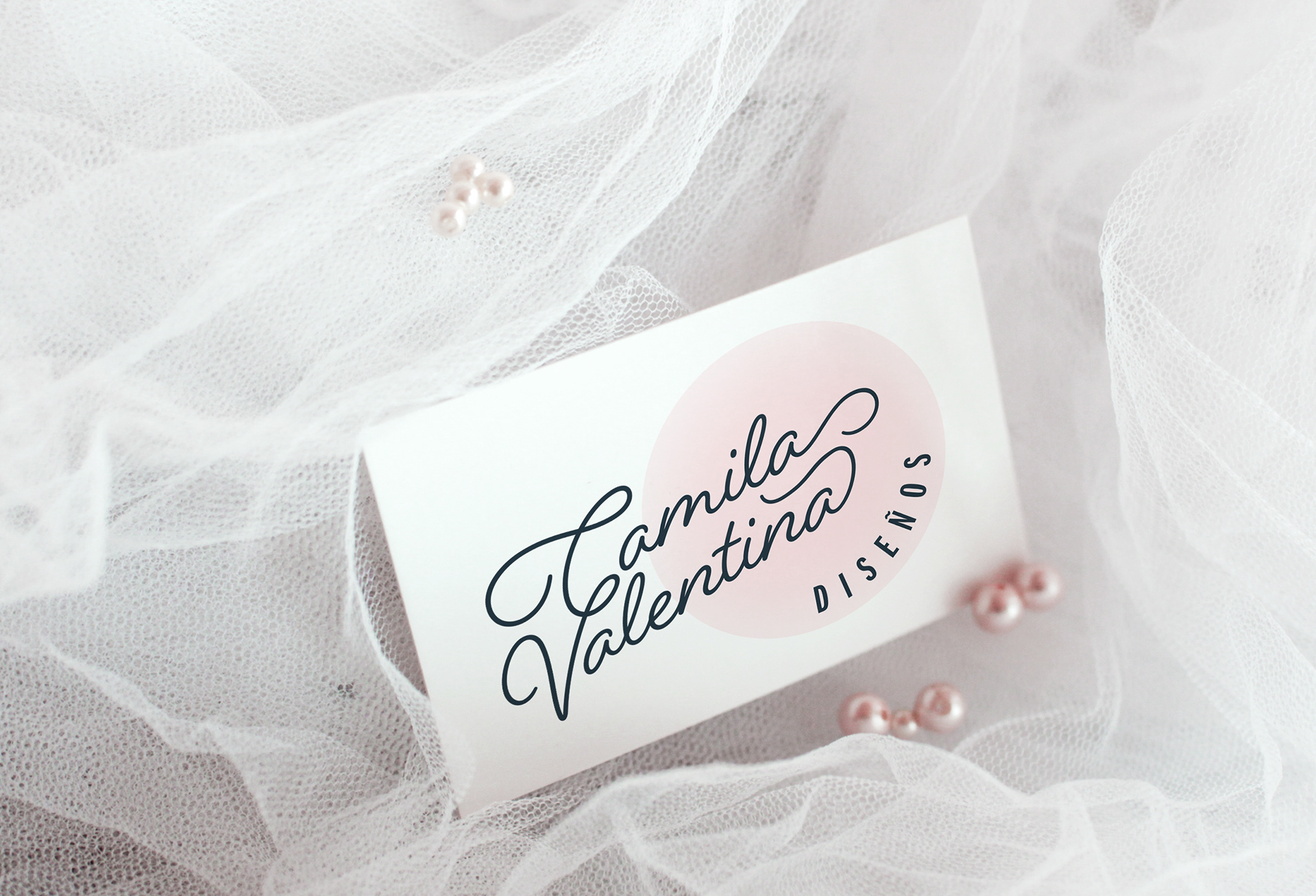
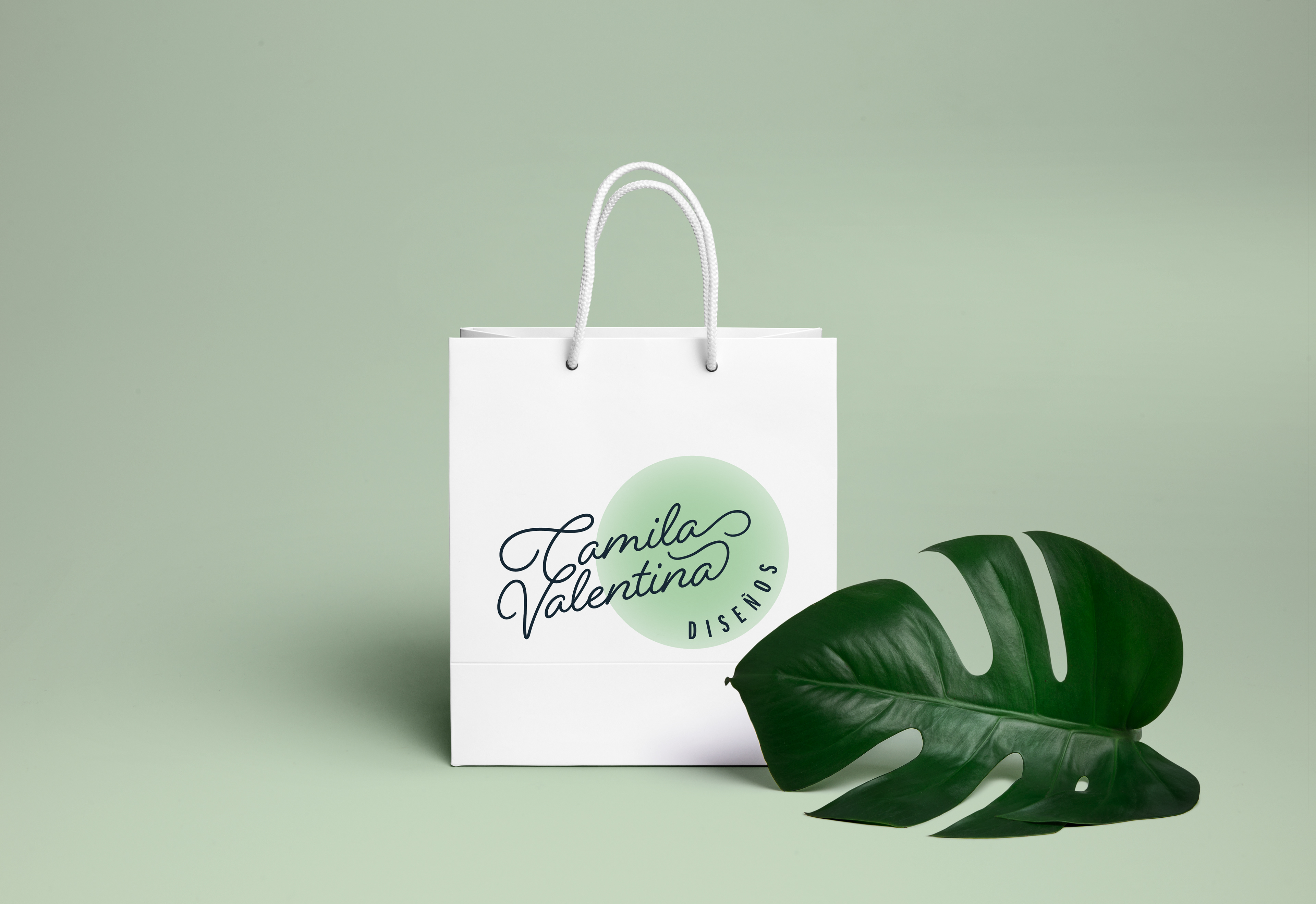
As 'Ca' is short for Camila, and 'Va' is short for Valentina, I made some logos that reflected that, and by having the girls' names in the script, and then connecting them (like the sisters they are) with the first letters in a custom swirl, and 'Diseños' being the supporting element.
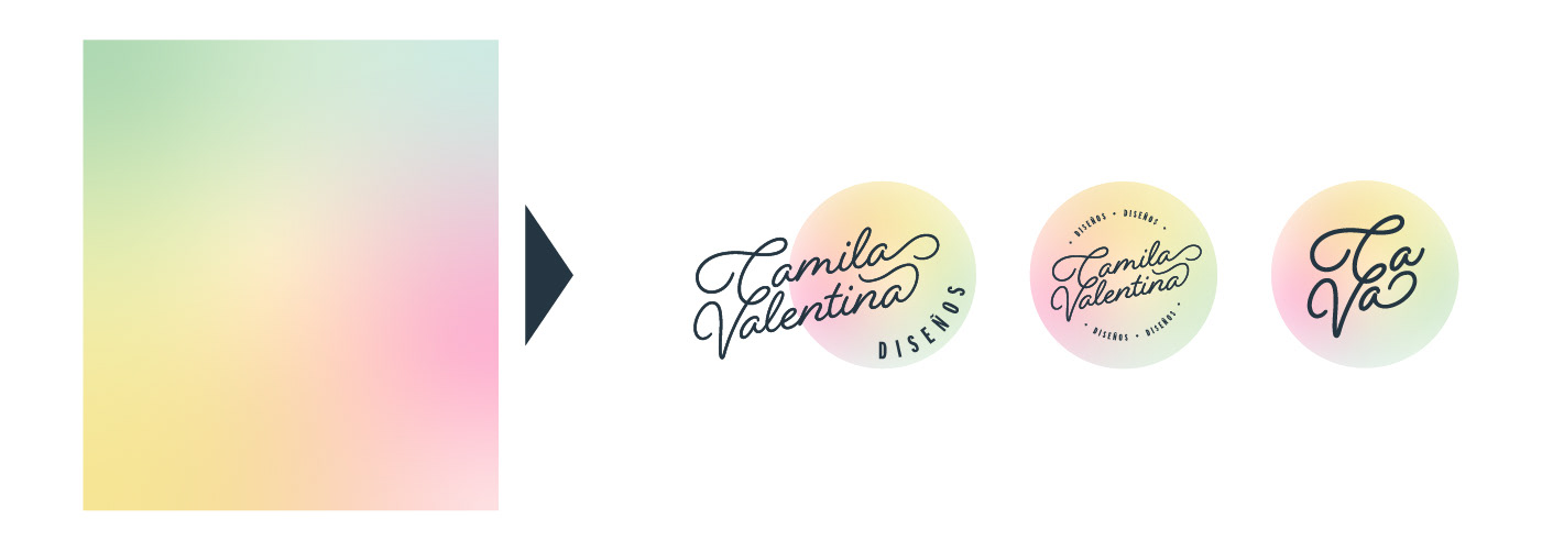
So with the brand's magical colors the logo was created in 3 different versions. I made one as a vertical version, which is the main logo, one circular version for larger surface areas, and one for application in smaller sizes.
Other Brand Elements and Instagram Highlights
Working with Ca-Va Diseños, and her being active on social media-platforms like Instagram, I suggested to her that I could design some on highlights for her. This would make her profile look more neat, and showcase those sweet and fun colors that are on-brand, and portray more trust and for her to seem more professional, and for her to take her business to new heights.
As a tool for her brand, I also created a custom gradient, utilizing her brand colors, to use for wrapping paper, backgrounds, etc. On the first highlight below, you can also see how I used the gradient as a background with the balloons, thinking this could be utilized for special events, discounts, celebrations etc.
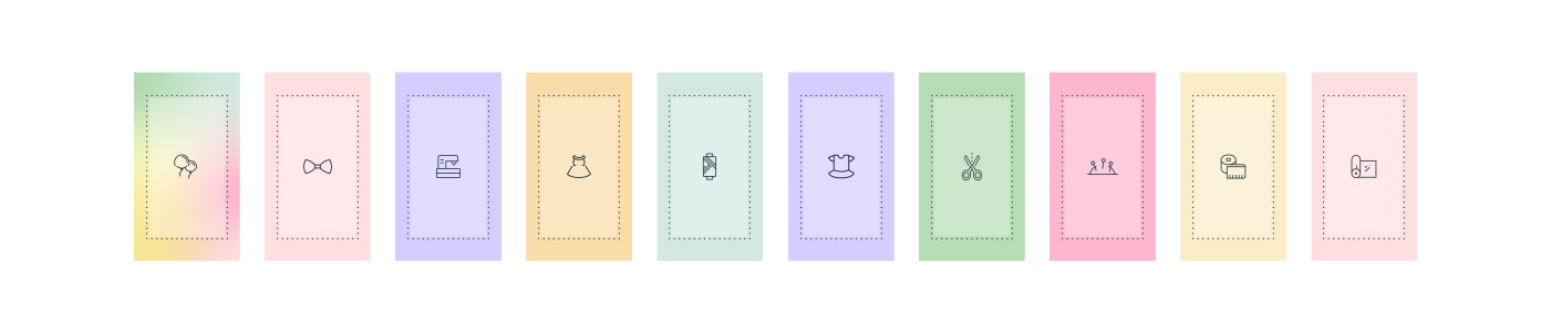
These are the Instagram highlights. I chose the icons based on the type of business Ca-Va Diseños is, and what she might want to do in the future.

All my design work is based on research and strategy.
In the future I might be adding more onto this project, through poster design and other brand collateral such as business cards, stickers etc.
Thank you for reading, liking or appreciating my project, I'm truly grateful!
Thank you again,
Ann-Jeanette

Other Credits
Mockup 1: Stationary Mockup by Marina Lauritzen via Unblast
Mockup, stickers: MockUpFREE.co
Mockup, paper bag: Graphicburger
Mockup, business card on fabric: Graphicburger