Branding for 'Farm Fresh to You'
Scope
- Colors
- Typography
- Logos
- GIFs
- Style Expression
- Brand Style Guide
Description
'Farm Fresh to You' is a "Farm-to-Door" family-owned delivery service of seasonal organic fruits and vegetables. They have a long tradition, and have been producing vegetables organically and sustainably since the 70's. In addition to fruits and vegetables, they also offer other farm-goods such as eggs, milk, cheese, etc. They let you customize the box after your needs and wants; theme, size, add-ons, and how often you want the delivery.
This rebrand was based on "Farm Fresh to You", a real service from USA, you can find them here. My task was to rebrand and adapt this service to my local surroundings, which in this case was Merida, Yucatan, Mexico.
This rebrand was based on "Farm Fresh to You", a real service from USA, you can find them here. My task was to rebrand and adapt this service to my local surroundings, which in this case was Merida, Yucatan, Mexico.
I did extensive research of competitors, market and strategic choices. I also identified market group, and the drivers and barriers for buying the product (as seen further on).
Typography
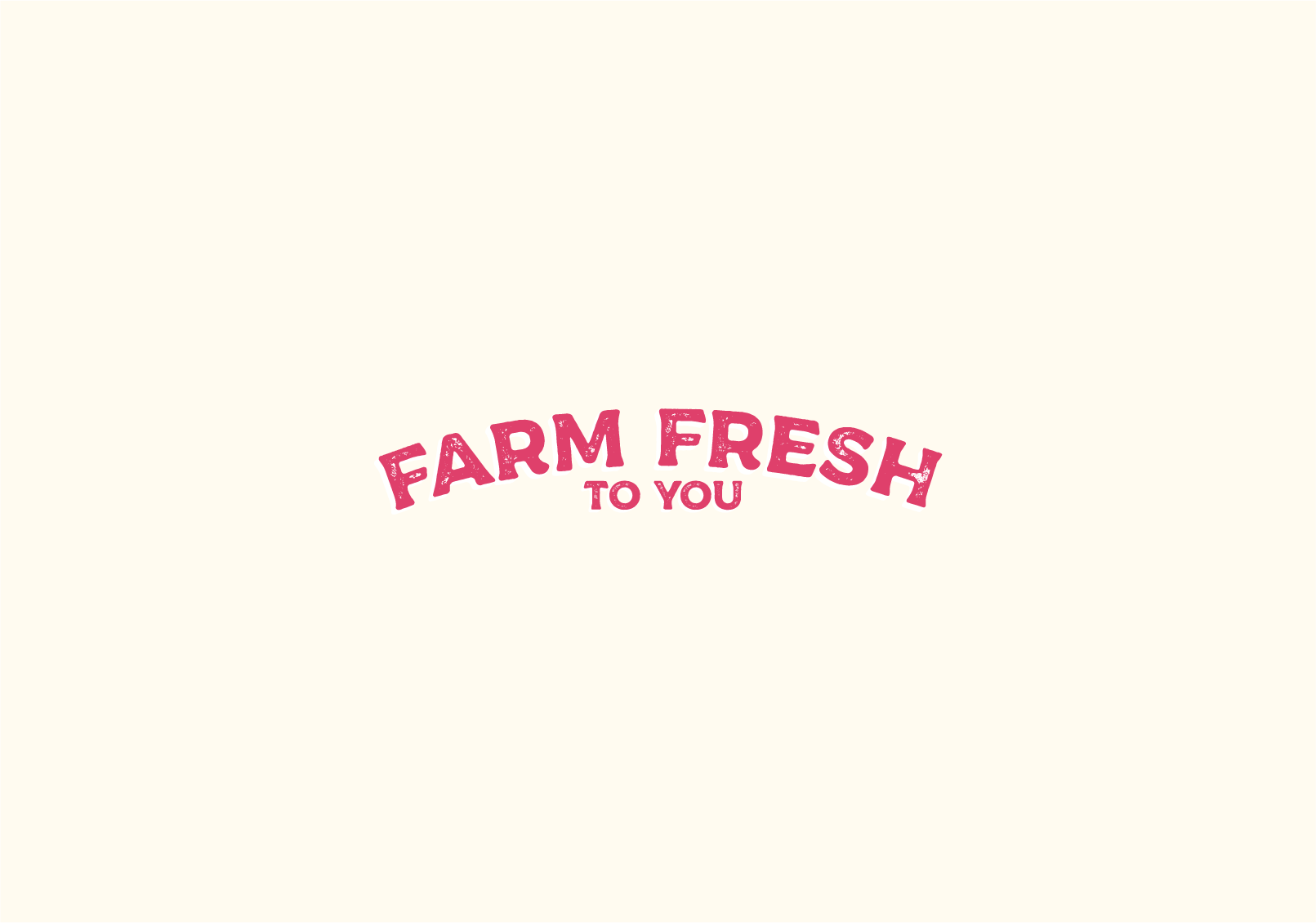
The typography is Messenger Typeface, designed by Alex Joganic. It is inspired by "vintage packaging". I have chosen it for its traditional feel, and it also brings a sense of craftsmanship and quality. It is perfect for the logo, and to communicate that the vegetables are organic and therefore high quality.
Colors
As the market intended is Mexico, I chose some fresh colors. Normally, considering high quality farming, I would choose warmer colors, but warm colors for this particular market would not communicate that, nor the freshness, rather the opposite would be true.
I chose "Melon", a soft pink, "Laurel Green", a soft green, and then I added their stronger, more saturated match, "Amazon" green and "Paradise Pink". I also added a yellow called "Orange-Yellow".
Logo
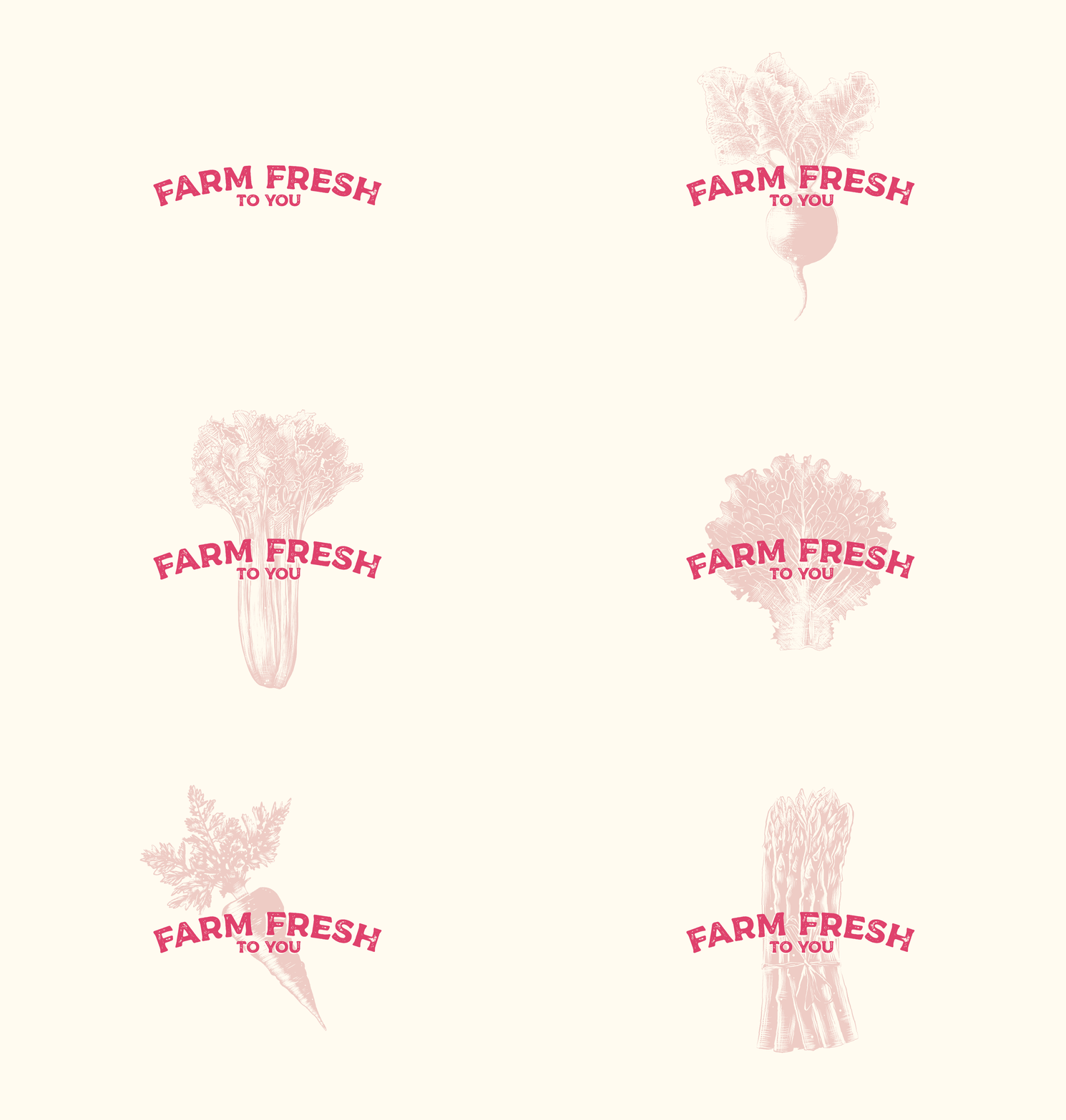
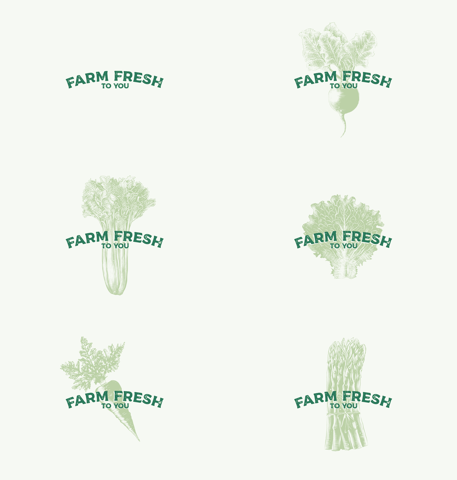
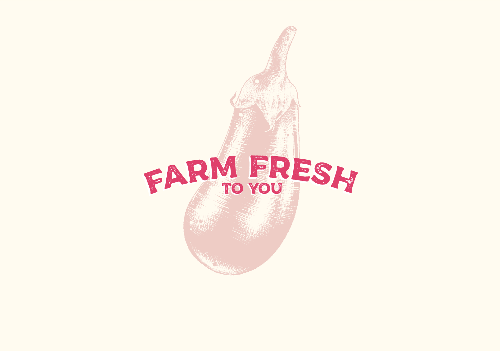
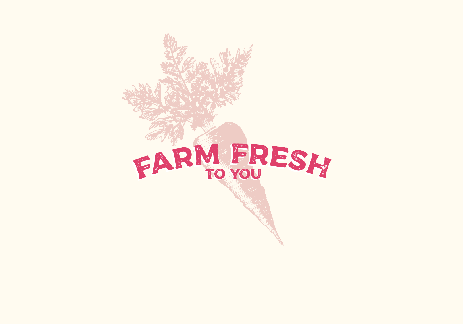
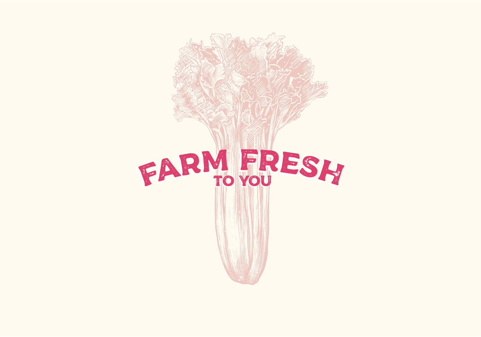
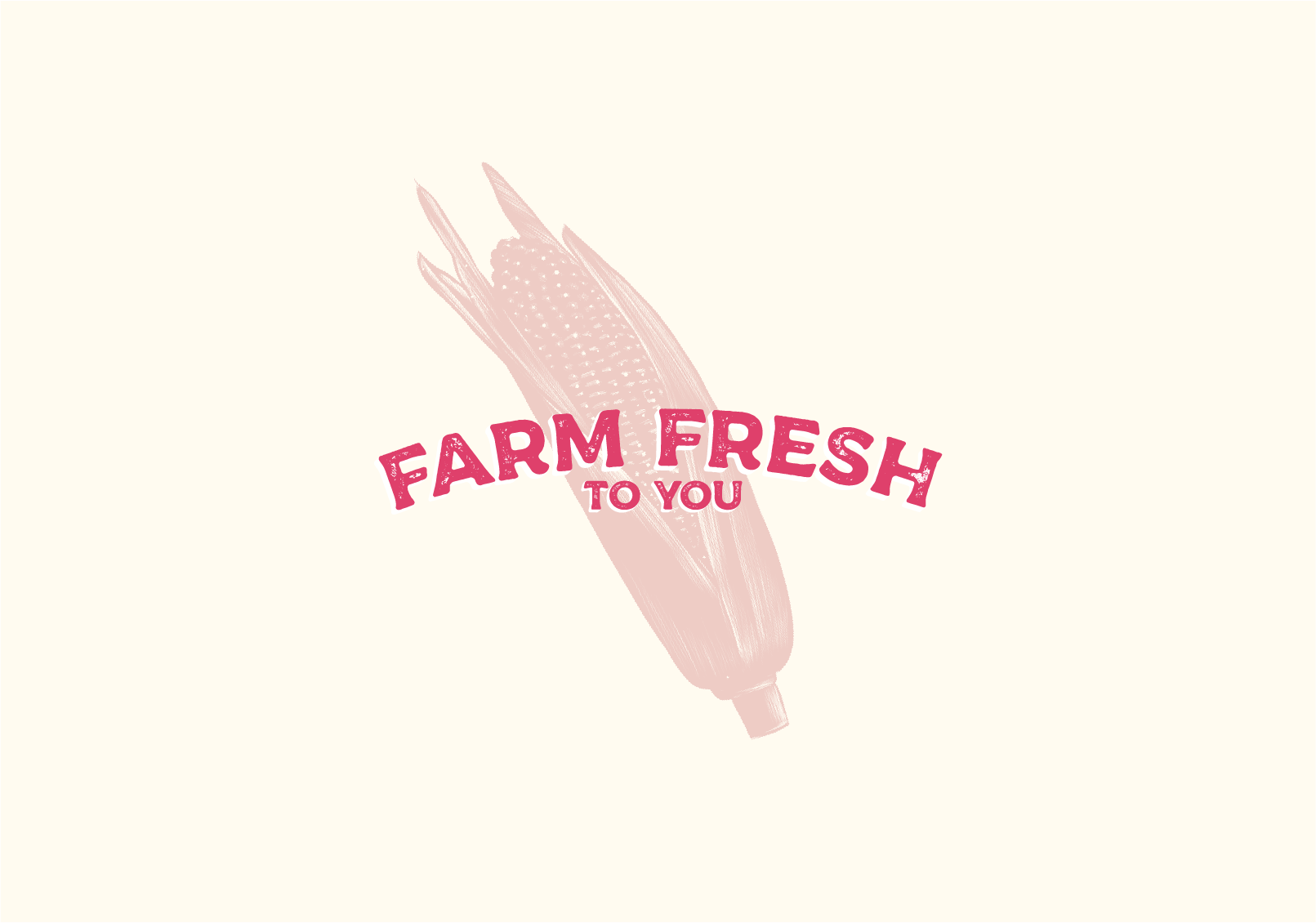
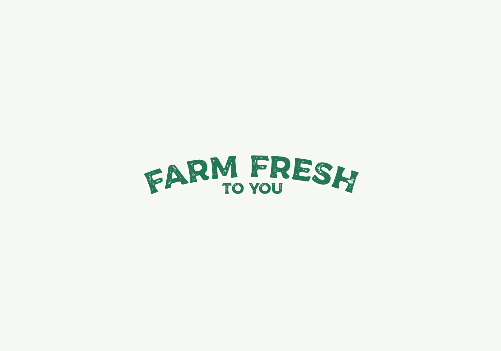
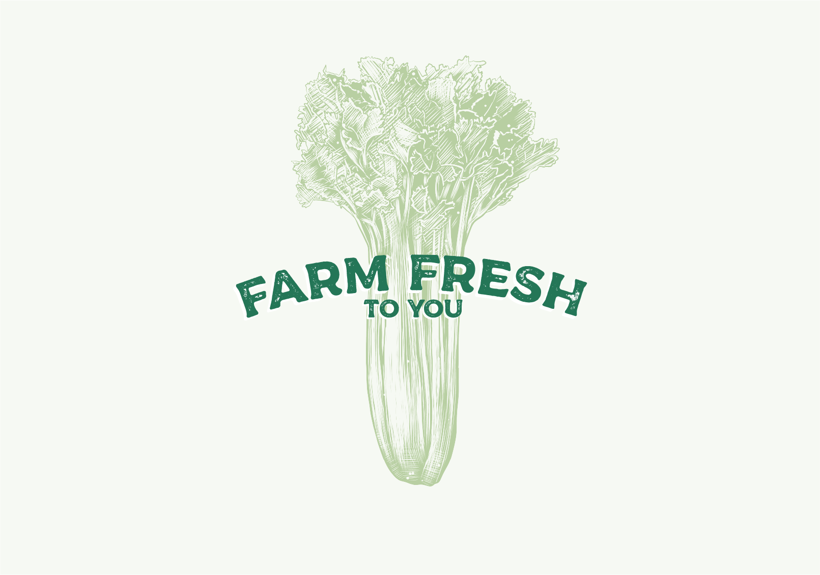
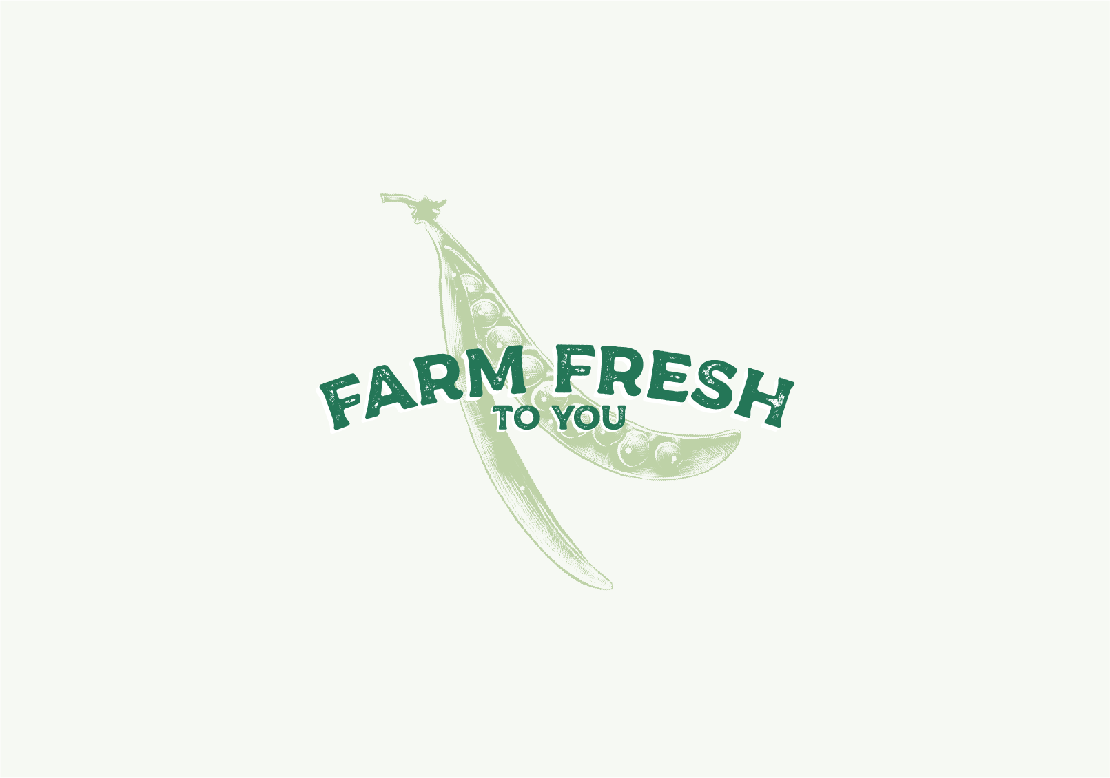
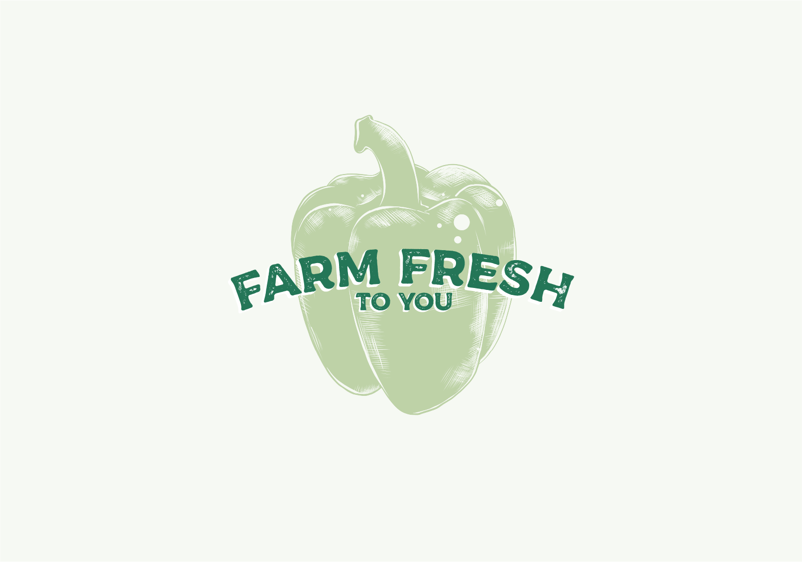
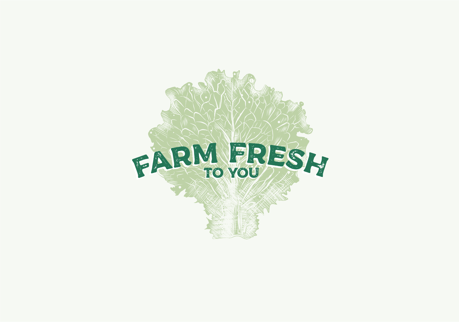
The logo is built on an arch, and focuses on the "Farm Fresh", with "to You" as secondary in the hierarchy. I then added on a back layer, and filling in the letters to become thicker, and gain some substance and depth. It is not a "just" drop shadow, and is drawn by hand and filled in per letter, in order to not lose that handcrafted and organic feel. It also accentuates the texture, especially on a colored background.
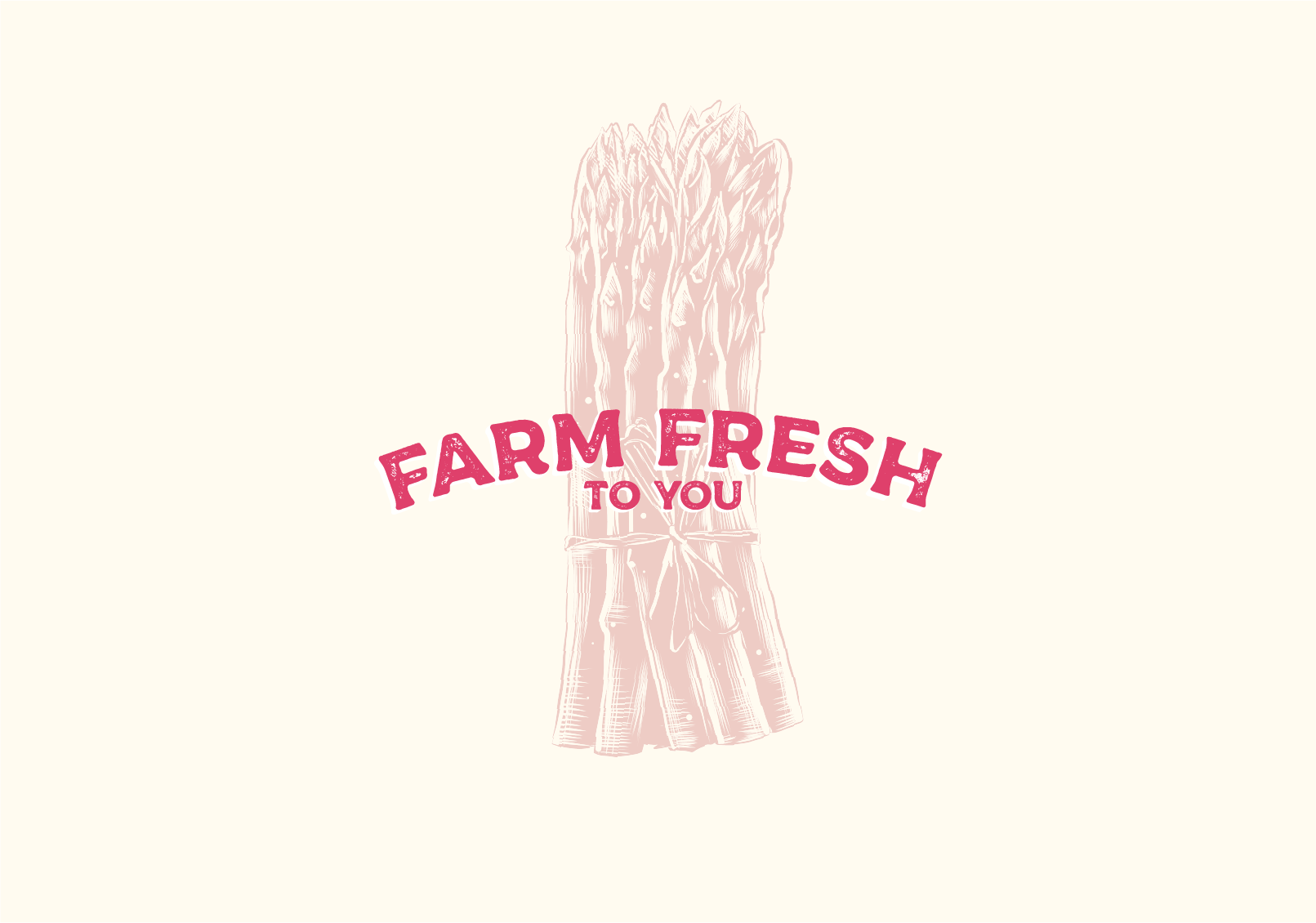
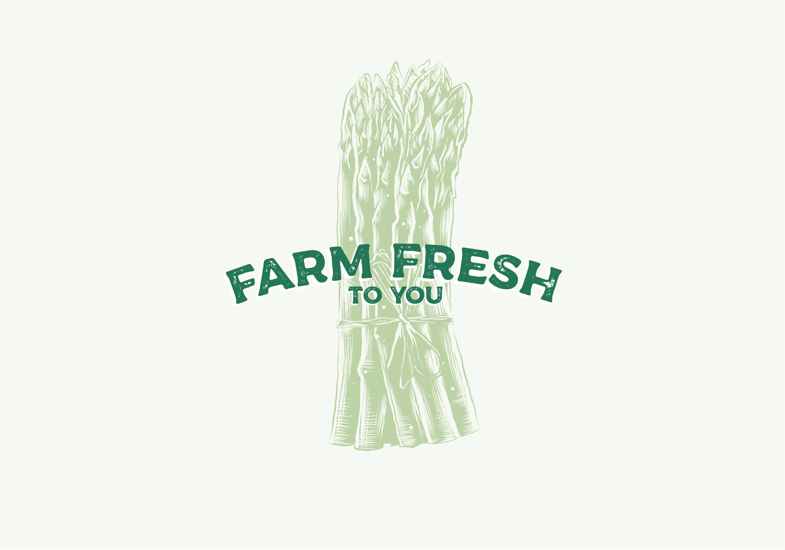
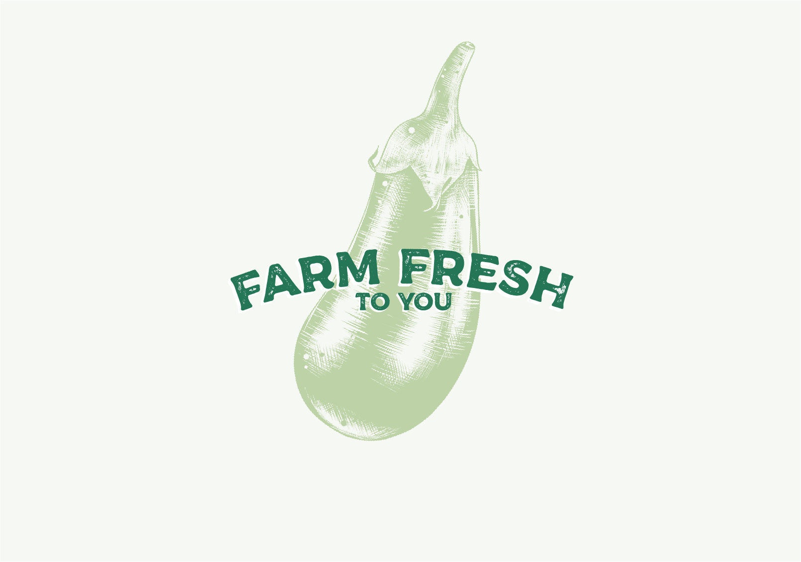
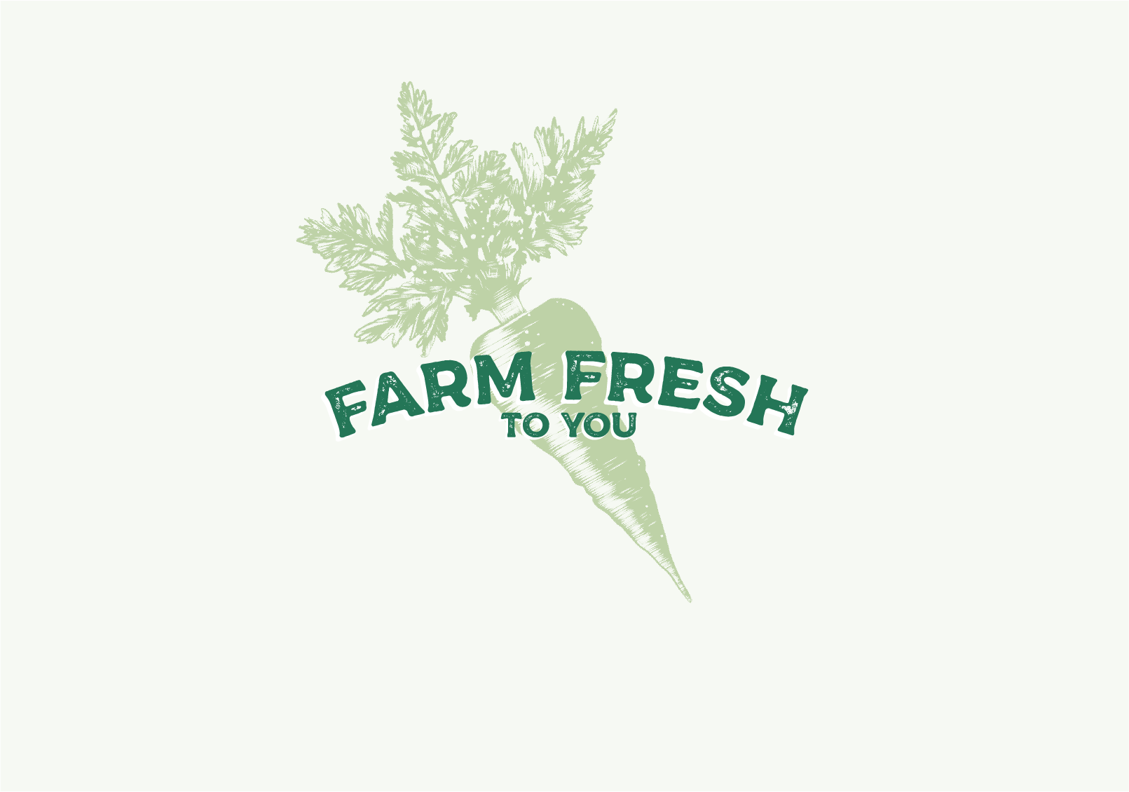
The logo does not have an additional mark, but can be used on top of all the vegetable illustrations (more info on the illustrations in the credits at the bottom).
The logo comes in different colors, and can have inverted colors as well, depending on the background. Right now, I'm focusing on the Amazon (green) and the Paradise Pink with a near-white filling. In the future, more colors will be added.

Drivers
Convenience:
Must have hours of convenience for delivery to the customer, and they must arrive on time, or within a period of time. Must not break customer promise without compensation to the client, must value the clients.
Must have hours of convenience for delivery to the customer, and they must arrive on time, or within a period of time. Must not break customer promise without compensation to the client, must value the clients.
Releases stress and time:
By buying this product, the customer releases the need to go to the supermarket/store and therefore it releases a lot of time, that is valuable to the customer, that the customer now can spend on other things.
Example: Family
Example: Leisure
Example: Family
Example: Leisure
Health:
By buying this product you are guaranteeing the health of the customer, by ensuring quality and organic, healthy food without the use of harmful chemicals and pesticides, which is not easily found elsewhere with the same guarantee. The produce is not transgenic.
By buying this product you are guaranteeing the health of the customer, by ensuring quality and organic, healthy food without the use of harmful chemicals and pesticides, which is not easily found elsewhere with the same guarantee. The produce is not transgenic.
Guarantee:
Must stay true to their promise to their customer by delivering fresh, organic produce,
within the time chosen by the customer.
Must stay true to their promise to their customer by delivering fresh, organic produce,
within the time chosen by the customer.
Easily accessible:
Must be easy to contact the delivery agent, and the company for any questions,
and/or changes in schedule, menu, etc.
Must be easy to contact the delivery agent, and the company for any questions,
and/or changes in schedule, menu, etc.
Lifestyle:
It fits and complements a healthy diet/lifestyle, a vegetarian diet/lifestyle, a vegan diet/lifestyle, a fitness lifestyle, a professional lifestyle, a stay-at-home lifestyle, etc.
It fits and complements a healthy diet/lifestyle, a vegetarian diet/lifestyle, a vegan diet/lifestyle, a fitness lifestyle, a professional lifestyle, a stay-at-home lifestyle, etc.
Environmental:
The customer saves gas/fuel/CO2-emmision by not having to go to the store as often as before. This could be further enhanced by the delivery van fueling on electricity.
The customer saves gas/fuel/CO2-emmision by not having to go to the store as often as before. This could be further enhanced by the delivery van fueling on electricity.
Barriers
Weight with packaging:
It mustn’t break, must be able to handle a great range of kilograms in order to not break during transportation when boxes are stacked on top of each other, and being handled between delivery and client. Must look appropriate, as it could damage the brand if it does not look “flawless” upon delivering product.
Freshness and controls:
The produce must contain its freshness from packaging to delivery.
It must feel fresh, and it must not be damaged, or infected with worms etc.
The produce must contain its freshness from packaging to delivery.
It must feel fresh, and it must not be damaged, or infected with worms etc.
Size of packaging:
Should have enough space for produce, in order to maximize the efficiency
of the total number of boxes, capacity, on each delivery. This lowers delivery
costs and might be very important to the company and its survival.
of the total number of boxes, capacity, on each delivery. This lowers delivery
costs and might be very important to the company and its survival.
Weight capacity of delivery van:
The total number of boxes able to be delivered, and its altogether weight, must not go beyond the maximum capacity of the delivery van. As this makes for less effective rounds for delivering. This can be important
to the company in order to be cost efficient.
to the company in order to be cost efficient.
Packaging for Produce:
The clients must be able to easily carry the produce with two hands, it must be maneuverable, and produce should not fall out of the box. The weight should not exceed the normal/suspected
strength of the customers within the target market.
strength of the customers within the target market.
Temperature/Weather:
The packaging should be able to protect the produce for any unsuspected rise and fall of temperature,
this will ensure the quality of the produce to the customers, and/or any other weather conditions.
The packaging should be able to protect the produce for any unsuspected rise and fall of temperature,
this will ensure the quality of the produce to the customers, and/or any other weather conditions.
Delivery van:
The delivery van should have a large weight capacity, and a functioning A/C for the container space of the produce. This is to ensure quality. It must also have appropriate equipment to endure any weather conditions.
Example: Extreme heat in Merida, Yucatan, Mexico, especially when turning the car off and leaving it in the sun.
Inability to recognize the brand and its ideals:
The brand should be recognizable to its target market, and should follow certain “clichés” in order for people to recognize that it is food, and that it is organic. It should be recognizable and customized for every touch point, but follow branding throughout.
The brand should be recognizable to its target market, and should follow certain “clichés” in order for people to recognize that it is food, and that it is organic. It should be recognizable and customized for every touch point, but follow branding throughout.
Mockups
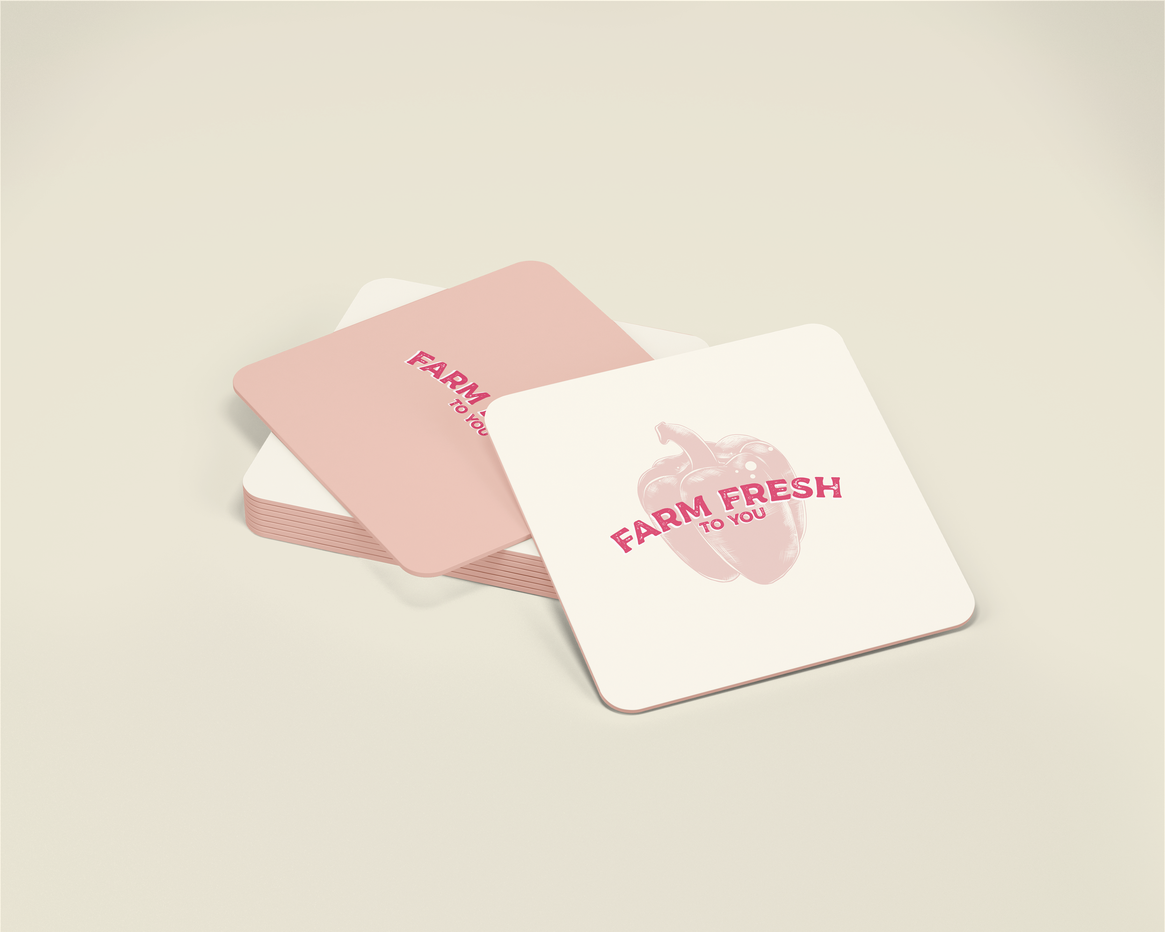
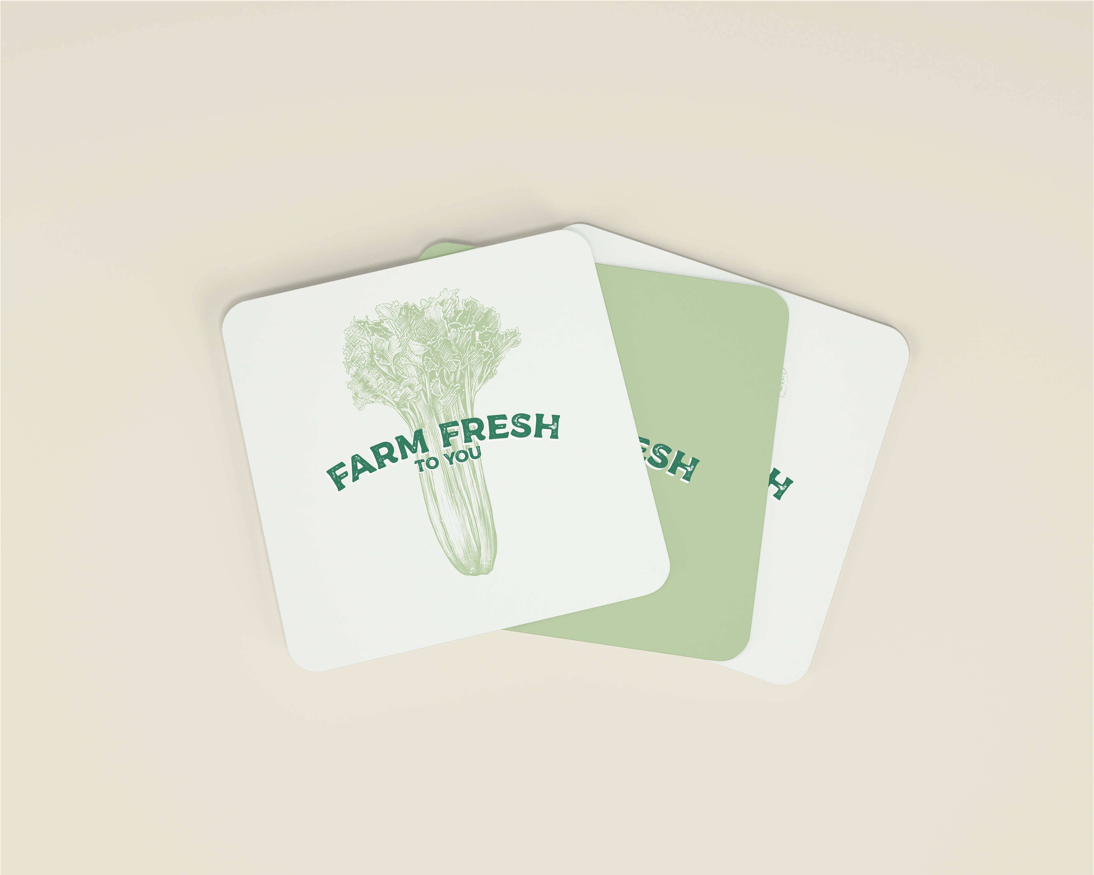
I've also added some mockups for this project, and will be continuing to add on more.
Right now, I have made some aprons, and some coasters.
I chose to make those, thinking that they might extend to have an office/shop/café where you'd be able to shop your vegetables directly, and perhaps have a refreshing juice whilst there.
I will be adding on more touch-points later on, like the packaging and a car-wrap, as well as further explorations towards brochures and uniforms.
GIFs
I have created a couple of GIFs showcasing the logo, and some of the different vegetables, in both colors schemes. They are the ones you saw above, and here they
are again in video-format.
are again in video-format.
All my design work is based on research and strategy.
In the future I will be adding more onto this project, through packaging, car-wraps, etc.
Thank you for reading, liking or appreciating my project, I'm truly grateful!
Thank you again,
Ann-Jeanette
Other Credits
Vegetable Illustrations: Akimo Mia
Illustrations purchased through Creativemarket
Illustrations purchased through Creativemarket
Mockup coasters: Mockupfree.co
Mockup apron: Mcckupfree.co
